The Surface Design Association left its mark on First Friday in Kansas City in June, and my group of friends started at the “epicenter” of the SDA’s influence, the Belger Arts Center, where the association’s Members Show, “Surface Matters,” occupied the ground floor exhibition area.
More than 200, eighteen-inch-square pieces were submitted to the show, which was judged by Alice Kettle and Jennifer Angus. Both of these judges also had solo exhibitions on the third floor.
The Belger
 Center allowed me to take photographs, so I have a nice group of them for this entry. The first one shows part of the exhibition area, next to the movable glass garage-door-style entry area. The second shows a view of the same door/window, now raised some, from the outside. I think this makes the former warehouse an interesting and flexible display space.
“Surface Matters” offered an interesting array of materials, colors, and approaches, despite the rather rigid size requirements. While most were fairly flat, some extended well into the third dimension. Inevitably, some appealed to me more than others.
I have chosen six to include here. I think that for me the most interesting aspects were rich colors and surface textures, a certai
 n amount of 3-dimensionality, and a certain amount of layering. As you'll see from my choices, I am drawn consistently to these qualities, as well as to fairly vibrant colors and quite often, diagonals moving through the picture plane. As you also will note, however, the artists each have made a unique and personal statement with their pieces.
At right is a good example of many of these qualities: Aerial Map #3, by Rebecca Cross. The rich texturing of the repeated lines of stitching give character and dimension to the background areas, and complement the 3-D parts that splash acro
 ss the picture plane at a diagonal.
Timeless Memory, by Gerri Calpin at left, uses many similar elements, and even some of the same palette, but evokes a more subtle mood.

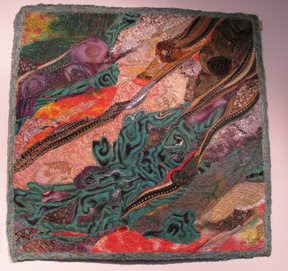
You'll note the diagonals, strong colors, and rich surface textures once again in Malachite, at right, by Marianne Williamson. Williamson, however, uses a greater variety of textures, and a broader range of colors.
We find an even brighter burst of colors in Calypso, below left, by Phillipa Lack. Here we find a greater variety, not only of colors and textures, but also of materials, including
 the shiny beads that sparkle through the composition evoking the theme given by the name.
Brooke Atherton also used beads to enrich the surface of her piece, M
 atriarch's Child, below right. Her bold diagonals are splashed across a more stable square shape at the center, keeping a dynamic tension between the irregular lines of stitching and surface enrichment, the rough X-sh
 ape at the center, and the duller, cooler, more stable and calm squares that anchor the composition.
The squares are a bit more irregular in Pieces Moving Through Dimensions, by Hellenne Vermillion, at left. We still have diagonals working here, and the surface texturing is just deliciously rich, but the palette is more subdued, and the key much lower, except for the high notes in the center area.
I hope you were interested to see these images from the "Surface Matters" show. Going to see it was a valuable experience. I'm looking forward to next year's show!