Thursday, November 22, 2012

One step forward, two steps back

Seems like just when you think things are looking up, it's time for another look.

Choice: Accept or Reject by Yu Chang
The "obscene" statue that isn't
I recently was pleased to see that the grand jury convened to decide whether an Overland Park Arboretum statue (subject of one of my previous posts) was obscene or not, had taken very little time to decide it is NOT.

Choice: Accept or Reject, by Yu Chang, had been the subject of hot controversy earlier this year, when a group of local fundamentalists aligned with the American Family Association circulated a petition to have it removed. They said it was obscene because the female subject was only partially clothed.

From the beginning, Overland Park officials denied that there was anything "obscene" about this work, and resisted the idea of removing it. The AFA group, however, was able to collect enough signatures to require that a grand jury be convened.

Thank goodness the grand jury had the excellent sense to deal quickly with this nuisance complaint. The group was demanding that the sculpture be removed, but certainly not doing any fundraising to support such a large public expense. I'm sure they aren't planning to pay for the cost of empaneling the grand jury, either.

Cement saws left obscene scars in the looters' wake.
A horrifying case of theft and vandalism in a sacred place
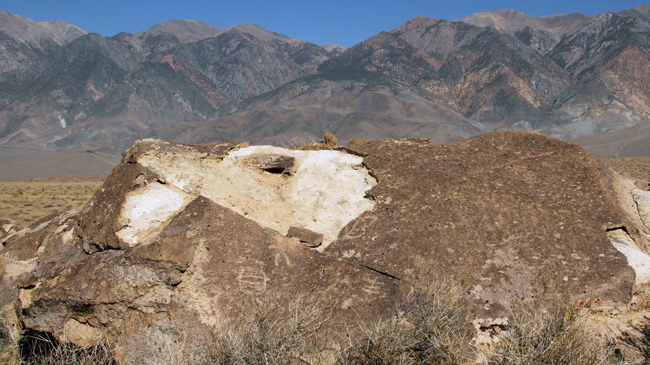
Not all the recent news about art in public life has been good, however, I was horrified to learn of the recent theft of four ancient petroglyphs from a site near Bishop, CA.

Stealing a petroglyph is no easy feat--and in this case it was done with all the finesse of a smash-and-grab, by a well-organized gang of looters who left ugly gashes, saw cuts and hammer marks--as well as one broken and abandoned petroglyph--in their wake.

The 3500-year-old petroglyphs were part of a site on the National Register of Historic Places, in the Volcanic Tableland area. Greg Haverstock, a Bureau of Land Management archaeologist described it as "the worst act of vandalism ever seen" at the BLM site, in a story posted by the LA Times.

All they left here was an ugly scar.
The site is a sacred place to the Paiute-Shoshone tribal members in the area, so it is as if the thieves had looted an ancient temple or cathedral. While not quite on the scale of the destruction of the Buddhas of Bamiyan, this senseless act--priceless treasures hacked to pieces for a potential market value of maybe $500 to $1500--leaves me feeling angry and violated. I can only imagine how the Paiutes and Shoshones must feel.

I don't normally like to use profanity on this blog, but fellow blogger Marina Galperina got it just right when she described these looters as "assholes with chainsaws." I hope the BLM catches up to them quickly, and nails them with every penalty possible.

Meanwhile, happy Thanksgiving.

PHOTO CREDITS: The Fred Blocher photo of Choose: Accept or Reject is from the Kansas City Star's Johnson County 913 magazine. The image of the petroglyph with saw marks is from the Bureau of Land Management, via the New York Daily News. Finally, the hacked-off rock photo came from Maria Galperina. Many thanks to all!


Thursday, October 25, 2012

Not quite ready, yet!

Anton's wasn't open when we visited--but soon!
Several weeks ago I saw an article in the Kansas City Star (somehow the link is now gone!), about a new gallery above a restaurant in the KC Crossroads.

Called the Main Street Gallery, it was to be on the second story of a place named Anton's Taproom at 1610 Main, Kansas City, MO. The article said the gallery was open during the restaurant's business hours.

What fun, I thought, and made arrangements with a friend to have lunch there around the end of the month. Accordingly, my friend Nancy and I showed up there for lunch today.

However, we quickly found things had not progressed as rapidly as the newspaper article had led me to believe. Anton's sign was up, the lights were on, the door was open, and the proprietor was there with his work crew, busily trying to get the business ready to open sometime next week.

There's even art in the wine cellar, next to the herbs and tilapia.
He seemed happy to see us, even though he couldn't feed us, and eager to talk about his vision for the place, from the custom brews, to the aquaponics setup to grow fresh herbs and tilapia next to the wine cellar downstairs. "Go on down and take a look," he urged us, when we seemed interested.

So down the stairs we went, to startle another workman, and gaze speculatively at the herb seedlings sprouting from mats suspended over dark vats, which we assumed must contain (or be slated to soon contain) the promised tilapia.

The place may not have been officially open yet, but there was art a-plenty, even in the wine cellar. Paintings in a wide variety of sizes and styles hung from the walls--or, in a few places, leaned against them. There also were several 3-D works as well, including a couple of whimsical assemblages and a tableful of large, lathe-turned wooden pots.

We wandered around, enjoying the artwork, and also relishing the opportunity to share a small glimpse of the sublime state when exciting dreams have almost ripened into actuality.

Anton's Tap Room and the Main Street Gallery are going to be a very cool place. We felt specially privileged to see it just before the blossom opens.

This post was updated and corrected on Oct. 27, 2012.
PHOTOS: The two photos I've added were taken by me, Jan Gephardt, with my iPhone, on October 25, 2012, after receiving permission. See the Main Street Gallery's website and Facebook page for images of some of the artwork there.

Sunday, October 21, 2012

War Eagle seemed smaller this year

Autumn in the Ozarks--a scenic setting by a rustic mill--yep, must be War Eagle!

Attending the War Eagle Fall Fair is a long tradition for my family, with my father's home located nearby and many friends exhibiting their work at the show.

I remember when there were at least six tents "over the bridge" on the hilltop overlooking the mill; this year, they were down to four. I had heard the overall quality was down, but I can't agree. It may have been smaller, but what I saw looked good.

I made a point of shopping with my "regulars," or at least stopping by to see what's new.

I plan to profile several War Eagle artists in future posts: Marianne Hanson, who makes wonderful porcelain jewelry; Joe Henderson, of Willow Brook Leather; Jeff and Judy Goodwyn, of Daaman Jewelry; and the "personality-plus" birds of Rick Lorenz.
Here's the old War Eagle Mill (where they still grind grain) and the bridge over the creek. Artist tents are on the other side.
This post was updated 10/24/2012.
PHOTO: I took this photo with my iPhone at the War Eagle Fall Fair on 10/21/2012, south of the bridge and mill.

Saturday, October 20, 2012

Big Bella Vista show!

We went to the Bella Vista Arts and Crafts Festival today. It was a big show--noticeably larger even than last year. 
Here's a view of the north side of the Bella Vista Arts and Crafts Festival.
I found several artists of note--most particularly a paper sculptor! His name is Russ Erickson, and he also makes the paper. He does florals and other subjects.

Other highlights included the innovative ceramics of Bear Hollow Pottery, the striking wildlife art of Christina Smith, and the whimsical fantasy of Fleming Art Studio, not to mention the one-of-a-kind glass pieces by Steve Brewster.

I plan to write more about each of these in future! (This post was updated 10/24/12).

PHOTO: Taken with my iPhone on Sat. 10/20/2012, it shows a view facing east, just north of the food vendors and south of the first line of tents.

Friday, October 19, 2012

A quick report from the road

Unfortunately, this page is not available for free online.

I am still working on being able to afford a laptop, so I am writing this post with my iPhone Blogger app, and still figuring it out.

Therefore, this will be short, with only one picture (haven't been to any shows yet).

I have traveled to Northwest Arkansas, in part to see some of the many art and craft fairs going on this weekend.

There are LOADS of them! One of the oldest, the War Eagle Fair, actually is listed on the local newspaper's special map spread as three different shows.

The photo shows the map, which was compiled and published by the Arkansas Democrat-Gazette.*

My husband is working with our friend Randal Spangler at the Bella Vista Arts and Crafts Festival, in another cluster of events listed on the map.

In all, the map lists about two dozen different events.

I hope to return with photos, links, and wonderful artists to feature in future posts. Stay tuned! (Updated 10/24/2012)

*Anything older than 7 days is archived by the Arkansas Democrat-Gazette, and is only available upon payment of a fee.
PHOTO: I photographed the "art fairs" map spread of the Arkansas Democrat-Gazette with my iPhone in my father's back yard near Beaver Lake.

Sunday, October 7, 2012

If it's Visual, is it Automatically Stupid?

I recently saw an item in Education Week about an effort by the group Reading is Fundamental to incorporate the arts into the teaching of the STEM disciplines--that is, Science, Technology, Engineering and Math.

Early childhood literacy is vital--but what happens later?
I let my imagination play with that idea for a while, and quickly thought of many ways we could have developed arts-based explorations of these disciplines for high schoolers in any of the places where I have taught.

The things I was thinking about would not have "diluted" the teaching--indeed, some of them would possibly have invited greater depth of thinking than some of the assignments I knew were actually being given in STEM classes at that time.

I was a bit disappointed, therefore, when I realized the RIF arts-integration program is targeted only for early-childhood literacy in the STEM disciplines.

It's not that I have anything against early-childhood literacy! I am a strong supporter of the 2000 Book Movement, which promotes the reading of at least 2000 books to all children before they are 6 years old.* Early childhood literacy is vitally important, and worth a great deal more investment and interest than we currently give it in the US.

But I balk at the idea that preschool is the only place where an arts-based approach is a valid gateway to learning. Simple picture books and preschool jingles can have quite grown-up analogs, though we too-rarely see them. The potential for richly-engaging Arts/STEM experiences for students (and their teachers) is truly vast at all levels. If managed well, such an effort could be a major game-changer for many people of all ages.

This is how many students feel about STEM.
Why? Because the deep psychological need that the arts fulfill for human beings is to provide access to new or difficult ideas. The arts give us an instinctual "vocabulary" or "set of tools" for thinking about confusing or unknown things. That's the deep-level reason why we do them at all: because the arts are an essential survival tool.

When the world confronts human beings with things we don't understand, what do we do? We hypothesize about them by telling ourselves a story about them, or creating a visualization, or singing or dancing how we feel about them, as seems appropriate.

How does that translate to the question of how we teach the STEM disciplines? Well, we seem to have trouble getting students to feel attracted to them, for one thing!

Generally, STEM materials look pretty dry. It's a consistent turn-off that
is totally unnecessary, in my opinion. We have ample ways to improve,
the teaching of Science Technology, Engineering and Math, using the arts.
Why do students resist the STEM disciplines, even when they are "required"? The reasons I hear most often tend to be that "they're hard," or "I don't understand them," or "they're boring!" (that last is often said with rolled eyes and a bit of a whine).

How better, then, to make them more accessible--even to those whose "primary intelligence" is not the "math/logical" one normally associated with those disciplines--than by using the tools that humans have developed over the ages as a survival necessity, precisely to help us successfully "fathom the unfathomable"?

How better to interface with the STEM disciplines, on ALL levels, than through the arts? Yet I can already hear critics attacking the idea for higher grades and college, for fear it will "lack rigor."

I long ago came to the conclusion that what most laypersons mean by "academic rigor" has little to do with in-depth critical thinking, and a great deal to do with memorizing longer lists of facts, dates, and equations, but it really seems to me that there is a prejudice in our culture, to the effect that if it's visual, then somehow it's been "dumbed down."

Roots of Human Behavior has unexpected depth--but
also "sells itself short," I fear.
A better realization of the depth that is possible with a visual-along-with-verbal approach came to me recently when I read/viewed a book titled Roots of Human Behavior by Viktor Reinhardt.

Published by the Animal Welfare Institute and clearly aimed at a popular audience, Reinhardt presents some basic--and not-so-basic--ideas about human and animal behavioral parallels, gleaned from his years of research, and he does it in a series of fascinating photos.

Unfortunately, the editorial staff for AWI seems to have bought into the idea of visual-as-dumbed-down, because Roots of Human Behavior sometimes reads like those sappy feel-good emails people send that end "if you care about someone pass this on to them" (you know the ones: they tend to have sparkly angels and animated GIFs).

However, the images themselves in this book are a great example of pictures conveying far more than could be explained with a great many un-illustrated words. I came to the end of the book with a weird feeling of having read something much deeper than it seemed to be--yet not as complete as it should have been.

I'd like to see a textbook on this subject, illustrated with exactly the same images. I bet even high school kids would be willing to put up with what they might otherwise have considered "boring" equations, tables, and technical definitions, if the textbook was illustrated with such a profusion of telling images.

As more educational materials go digital and interactive, I think we inevitably will see more and more visual and auditory approaches to material, in an effort to make them more interesting and accessible. We must guard against the tendency to "dumb down" the visuals, however. Let's use the arts (all of the arts) to help us get to the deepest thinking and the most profound understandings. After all, that's what they're designed to do!

_______________
*Note: Read more about the vital importance of early childhood literacy, especially as it applies to the African-American community, in the informative book, African Americans and Standardized Tests: The Real Reason for Low Test Scores, by Dr. Veda Jairrels.

IMAGE CREDITS: The image of the little boy with the early childhood literacy materials on the floor around him is courtesy of the award-winning Bernardsville (NJ) Library! Belated congrats, guys! (the award came in 2009).  The "math is hard" cartoon is from the Bilerico Project blog: an image worth 1,000 words, and aren't you glad I saved you reading them all? The collection of "dry stuff"--books, pages of equations, chemical formulas, etc., is composed of images from several sources. See the links in the previous sentence! Many, many thanks to all! I looked and looked online for a cover shot for Roots of Human Behavior, but eventually had to scan it for myself.     

Saturday, October 6, 2012

A Change for my "Comments" Settings


I recently discovered that I have been making it harder to post comments to this blog than I had intended, because I was using Blogger's default settings. I have now changed the settings.

Many thanks to Lynette Burrows, who heightened my consciousness about this! Her blog Of Martians and Marshmallows is well worth following,  if you are interested in science fiction, writing topics, or thinking about things in general!

IMAGE CREDIT: Many thanks to the Shapeshed blog, for the "Post a Comment" image!

Thursday, September 27, 2012

Three More Paper "Wizards"!

On two recent trips to local art fairs, I have discovered three more wonderful artists who do unique and beautiful things with paper. It is my delight to share the work of Dan Bi, Kent Davis, and Angie Pickman with you!

Dan Bi told me he uses X-Acto knives to cut his amazing designs.
He must go through about a million blades a year, to have them
sharp enough not to tear his delicate paper!
Dan Bi
Unfortunately, Dan doesn't have much of a web presence--just an email address. Thus, I can only share one image with you.

I normally go to art fairs with my camera, but I never take photos of individual booths or specific pieces of art unless I have permission. Dan had a business card, but was very busy when I talked with him at this year's Plaza Art Fair in Kansas City, MO. I got out of his way quickly, and planned to visit his website for more information to share. (so much for that plan!)

Fortunately, another blogger caught him at a moment when he had more time! Many thanks to "Nancy" and her All Pulped Out blog! She posted the only online example that I could be sure was Dan's artwork (see above).

Dan uses the traditional Chinese paper-cutting art form of Jianshi (also spelled jianzhi) to create his mind-blowingly intricate designs. The tiger shown here, although it is beautiful, is not the most detailed design I saw.

Kent Davis's Albedo demonstrates that he has a
whole new approach to paper, wood, and light!
Kent Davis
I don't think I've ever seen an approach to sculpture quite like Kent Davis's. I found him at the Art Westport annual show in Kansas City, MO, and immediately knew I needed to share his work here on the blog.

He has brought a new and elegant approach to illumination, wall sculpture, and the art of creating structures of paper and thin strips of wood. These pieces are sort of an apotheosis of what a box kite would become if it could glow, and take on amazing and complex new forms.

I've included a couple of images here, but they only give a small taste. For more of Kent's amazing art, spend some time on his Luminous Inspirations website! The pieces I've shown here both use white light, but he also has done some beautiful work with colored lights, that are well worth viewing and enjoying.

I love the elegant shapes in Kent Davis's Smoke.

Angie Pickman's Find Light Wherever You Go gives an
example of her elegant knife-work.
Angie Pickman
I've been admiring Angie's work all year at various local shows (most recently Art Westport), and it is high time I shared her work with you here!

I love the "design" feel of her cut-paper work, where color is used strategically in a limited palette, to maximum effect. Pickman's subjects are usually somewhat mystical, and always seem to reference nature in one way or another.

Pickman's Permeating Sentiment draws on several of her
frequent subjects to make its statement.
This work may trace its roots in part to traditional silhouette pieces, but she has far transcended them.  I like to get up close and observe the detailed precision of the cuts. Like Bi, she must go through case-lots of blades in the course of a year. Unlike Bi, however, she has a website, Rural Pearl, to which I can send you! She also has an Etsy Shop, and sells prints as well as the orignial cut-paper designs.

I think you'll enjoy the variety and beauty of her work, but I also hope you'll admire the skill and the strong sense of design that imbues her work.

PHOTO CREDITS: As noted, I am in the debt of Nancy and her "All Pulped Out" blog for the Dan Bi photo (you may want to explore her blog further--there are some interesting things on there!).  
The photos of Kent Davis's Albedo and Smoke are both courtesy of his website, Luminous Inspirations. As I mentioned above, there are many more designs on the site, including some that use colored light. 
The photos of Angie Pickman's Find Light Wherever You Go and Permeating Sentiment are courtesy of her website, Rural Pearl. She has many more wonderful things to look at there, so please take a look!

Thursday, September 20, 2012

My first limited-edition paper sculpture

I've only completed one AP of Common
Cliff Dragon--Male
 so far. Here he is at his
August Art Night show debut--just before
his new owner took him home!
Common Cliff Dragon--Male is a small, relatively simple piece, but it breaks new ground for me. It is my first-ever limited edition of a multiple-original paper sculpture.

I've been working up to this for a bit more than a year and a half, since the first edition in the Mail Piece Project. My emphasis area for my undergraduate art major was printmaking, and most of my earlier fine art career was taken up with producing and helping to sell reproduction prints by myself and other artists, so the idea of a limited edition has never been strange to me.

During the first several years of doing paper sculpture, however, I couldn't see how I could possibly create a limited edition of them. Then I started the Mail Piece Project. Those pieces were more pop-up than paper sculpture, but as I worked on them I began to see more clearly how I could incorporate another "first love," ink drawing, into the process, and make printouts with archival paper and ink.

L-R: The White Dragon (2007), A Nest in the Wildwood (2008-9), Denizen of the Winter Trees (2009), and
Patterns in Turquoise (2011), the final piece in the "Snowflake Dragons-TNG" series.
To explore further, I needed a subject I knew well--it is only helpful to take on so many challenges at once. A dragon was a natural choice for me.

My first-ever paper sculptures, The White Dragon (2007) and A Nest in the Wildwood (2008-9) featured dragons. When I was figuring out a pattern prototype I started with a dragon in Denizen of the Winter Trees (2009). When I was figuring out how to manipulate color in Adobe Photoshop and Illustrator, I did my first experiments with "The Next Generation" of "Snowflake Dragons"(2011).

"Body" drawing
So it was back to the dragon-drawing board for this new effort. I started out knowing only that the image area should be about 5X7" and the subject should be a dragon. Then I let my pencil think for me, for a while.

The result was a pencil drawing of a dragon crouched on a fairly sheer cliff face.  I used tracing paper to trace first the wings, then a full view of the cliff face (no void, even though that meant much of what I drew would eventually be obscured by the body and wings--I wanted a certain flexibility in positioning). The original pencils provided the base for the body's ink lines.

I inked the tracings and scanned them, then added color using Adobe Illustrator and my new Wacom Bamboo Tablet. As I worked with the colors, the idea of a neutralized gray-green cliff background and splashy red-and-white coloration for the dragon began to develop. But what could possibly induce a species to develop the kind of coloration that would make it stand out brilliantly from its background?

Wings, with color added
Yes, I know: dragons aren't a real species. But if they were, they'd follow the same evolutionary patterns as real species, and I'm deeply enough steeped in science to know that most creatures--even those at the top of the food chain, such as tigers, leopards, and wolves--generally have some level of camouflage that helps them visually blend into their surroundings.

The main exceptions I could think of were birds and fish. In some of those species, the males display brilliant colors, both to attract a mate and to decoy enemies away from nests. One look at this dragon's wings should tell you I see him as more bird than fish! Goes along with the whole "feathered dinosaur" thing, in my mind.

Okay, so now I had a "logical" rationale for making him the colors I wanted to: he's in mating plumage. Maybe the rest of the year he goes around in drab gray-green, but during this one season he sports a complimentary color scheme like Christmas. And just to make sure the rationale is clear, I added a border and "scientific" information about him (If anyone reading this knows Latin, please check my usage!).

Even sporting red feathers, my cliff dragon was too well
camouflaged against the left-hand background.
I gave him deeper shadows in the background at right.
There still was the matter of the cliff rocks, and I went back and forth on this for a while. Even with all the red on him, he still tended to blend into the background a bit more than was helpful for an artwork (although I'm already extrapolating what kind of predator might prey on common cliff dragons. He wouldn't want to stand out so much that Dragon Eaters could even more easily spot him, or it could be a very short, unhappy mating season!)

My husband didn't care about Dragon Eaters. "I'd make the background completely black," he said. "That'll make him 'pop!'"

I tried a really dark gray screen overlay over the rocks, to see if I could live with it, but I couldn't dismiss thoughts of the Dragon Eaters, and it didn't look enough like the kind of lighting and background colors that worked with this dragon's coloration to suit me. Finally, I came to the compromise of giving him darker shadows to outline some key "edges." That way, I wouldn't feel required to put a pin through his back and claim he was a collected specimen in a shadowbox.

Scroll up and check to see if you think the darker shadows did the trick!

Finally, after all this, I had something I could cut out, sculpt, and assemble, sort of in the way I did with the roses I showed a few weeks back. The rocks are 3-D, as well as the dragon. To me, the sculpting is the most fun part, because it's a little like making magic happen.

There's only "AP #1" (the first Artist's Proof) so far. My little cliff-dweller is possibly still in development. I don't know if there will need to be more proofs (I sold AP #1 on its first outing, before my husband could see it), nor have I figured out an edition size. Even when I can print pre-made flat images, I still have to cut out the pieces, sculpt them all, and assemble each one by hand--a fairly time-consuming process, even though I can do it while watching Nature or Bones on TV. Perhaps I can take a reading on some of these questions if people leave comments (please? I'd love some input!).

Friday, September 7, 2012

The View from Above

I'm fascinated with the complex clouds I can see from a plane. 

I’ll fight you for the window seat.

For me, it’s about the only thrill left in air travel. Day or night, there’s often something to see from a new perspective, and it’s way more interesting than most in-flight movies (nighttime travel over thick cloud cover is a shameful waste of an opportunity, in my opinion).

Sometimes Nature paints with bold colors.
I love to look down at the patterns on the earth in clear weather: on the intricate patterns of landforms by day or the light-spangled darkness at night.

Even fairly thick clouds can offer amazing vistas of layers, canyons, or majestic peaks, and one of the most breathtaking spectacles I’ve ever seen was a nighttime electrical storm, as our plane skirted its edges.

Whenever I travel by air, my camera is always near at hand—and though it often isn’t equipped to capture some of the “best stuff,” I have sometimes managed to capture interesting images I can take back to my studio.

I couldn't resist this image, taken near Salt Lake City, UT.
Even those that don't make the best "photographer's choice" kind of image can offer me a wealth of subject matter. I'm always looking for ways to render them into paper sculpture in new and interesting ways. Perhaps I'll have pieces to show sometime soon!

PHOTO CREDITS: I took all the photos in this post, either on the outward-bound leg of a journey from Kansas City to San Francisco on July 13, 2011, or on the return trip July 18, 2011. These photos may be used under a Creative Commons license as long as they are not altered, and include an attribution to me and this blog.

Thursday, August 30, 2012

How Artists act as Urban Pioneers

Last month I wrote about a report from Americans for the Arts, which outlined the economic impact of the arts, particularly in my own hometown of Kansas City.

I also sketched in a few notes about artists as urban pioneers in Our Fair City: responsible for the current boom in what is now called the Kansas City Crossroads Arts District, and attempting similar neighborhood reclamations along Troost Avenue and in the West Bottoms.

Jim Leedy is still at work in the Crossroads Arts District of
Kansas City. He is the subject of a new film about his life.
A few days ago the Kansas City Star published a profile on a “first” pioneer of the Crossroads, Jim Leedy, who also is the focus of a soon-to-be-released film. Leedy is a former Kansas City Art Institute professor, and co-founder of the Leedy-Voulkos Arts Center. The Star article gives a more in-depth look at the work Leedy and his cohorts did, to create a nurturing place for new artists, and eventually bring economic renewal to what had once been a seedy warehouse district.

As in Detroit and other places badly impacted by the Great Recession, arts are providing an avenue for economic revitalization. Many states have begun to catch on. Even Kansas—where the infamous Governor Sam Brownback proudly demolished our Kansas Arts Commission, despite a bipartisan rebuke from the Legislature—has quietly instituted a new Creative Arts Industries Commission that replicates some of the Arts Commission’s previous role.

This crumbling warehouse in Utica, NY is the kind of place
where beginning artists might find cheap studio space.
The classic sequence goes like this: a low-rent district of dilapidated properties attracts artists, who go there at an early stage in their careers, in search of affordable studio space. 

Good places to look are warehouse districts that have fallen into disrepair, or down-at-the-heels business districts, where rents are low and nobody is too picky about a mess (art-making is generally not a drip-free, dust-free enterprise!).

This "Heidelberg Project" house offers an eye-popping
example of "visually interesting things in shared spaces."
Once they’ve established their studios, they collaborate, do visually interesting things with their shared spaces, and start putting on shows. People are attracted to this visually stimulating, offbeat creativity. They start coming frequently to see the art.

Other businesses notice that people are beginning to come to this area repeatedly, in ever-greater numbers. They develop a presence of their own, in this place “where it’s happening.” Business all over the area picks up.

Soon developers are offering “loft space” for urban-chic living, and the area becomes trendy. Gentrification is quick to follow, at which point the rents go too high for some of the artists, while others’ galleries are becoming more upscale, in tune with the neighborhood.

The ambiance of a successful arts district includes eateries
such as Benton Harbor, MI's Phoenix Cafe.
Now the original area is booming, still enjoying the “artsy afterglow” for several decades. Savvy businesses perpetuate the character of the neighborhood with sidewalk cafes, boutiques, and other interesting attractions, such as pocket parks, smaller, specialty museums, etc.

Meanwhile many artists have moved, looking for a low-rent district of dilapidated properties, where they can find affordable studio space . . . and the cycle begins again. 

PHOTO CREDITS: The Jim Leedy photo is by Rich Sugg of the Kansas City Star. The photo of the warehouse in Utica, NY is from the Utica Observer-Dispatch. The Ghost of Detroit Blog contributed the photo of the "Heidelberg Project" house in its blog post of the same name (couldn't find the photographer's name). The photo of the Phoenix Cafe in the Arts District of Benton Harbor, MI came from TripAdvisor.com's slideshow on the area.

Thursday, August 9, 2012

Other Paper Sculptors' Widely-Varied Art

Peter Calleson's 2006 work Holding on to Myself
Over the past few years I have encountered the artwork of several paper sculptors who have a very different approach to the medium than I do.

If you follow this blog you have seen my work and read accounts of how I make it, most recently in the just-previous post about my still-unfinished "Rose" piece and the idea of creating limited editions, and one from earlier this year, about some multi-piece animals I made.

Now I'd like to share just a few works by Peter Callesen, Allen and Patty Eckman, and The Mystery Paper Sculptor of Edinburgh.

Peter Callesen
Callesen is a Danish paper sculptor who specializes in one-sheet-of-paper pieces that can truly be amazing. His website features well over 100 of them, and I strongly urge you to go there and look at them. They are wonderful little miracles of the designer's art, and very adroitly created.

Peter Calleson, Looking Back, 2006. See his website!
I first learned about Callesen, however, in a screwy and backward way--through one of those chain emails that cycle around. A friend sent it to me, in the belief that it was a collection of entries to a contest sponsored by the Hirschhorn Museum and Sculpture Garden.

It wasn't.

Instead, it was a completely unattributed collection of Callesen works, passed off as entries in a contest that the Hirshhorn never actually held.

Why would someone create an email like this? Why totally rip off a wonderful artist, spread his work all over the Internet, and make false claims about his work? I totally do not understand the kind of mind that could do that.

I want to thank Roberta J. Morris and her investigative work for setting the record straight.

This is Allen And Patty Eckman's Eagle Hoop Dancer.
Allen and Patty Eckman

My first exposure to the work of Allen and Patty Eckman was also through an unattributed email.  A different friend sent that email, asking "Hi! Is this anything like the paper sculpture you do?"


I scrolled down to find a cascade of amazing, gorgeous, ultra-realistic, pure white pieces. I'd only been doing paper sculpture for maybe a year at that point, feeling my way along self-taught in a brand-new medium when I had time while in graduate school, and my first reaction was OMFG, if that's my competition I am SO dead.

Allen and Patty Eckman, Wife and Son of White Bull
My second thought was who is this artist, and how does s/he DO it??? As it turned out, "s/he" is a "they," and they are very generous in explaining how they do it. Since they invented the process, they rightly charge a fee, but the paper casting process they use is no secret.

I was able to track down the Eckmans when I received a second version of the email from yet a different friend--and this email had the grace to not only correctly credit the Eckmans, but also to include extensive quotes from an interview with Allen. I grumble that they didn't include a link to their website, but at least it's easy to Google "Eckman paper art."

Lucky for you, you don't even have to do that

As with Peter Callesen's work, I strongly urge you to wander through the Eckmans' online galleries. And prepare to be totally blown away.

The Mystery Paper Sculptor of Edinburgh
A pun on Ian Rankin's novel, Exit Music.
In a post about mystery-reveals regarding paper sculpture, how better to leave you than with a still-unsolved mystery?

I've been a follower of Robert Krulwich's blog, Krulwich Wonders, for some time, and last year he discovered a fascinating conundrum: an anonymous someone was leaving wonderful little paper sculptures made from books or parts of books in libraries and museums all over Edinburgh, Scotland, "in support of Libraries, Books, Words, and Ideas."

Krulwich spotlighted the seven sculptures known to have been discovered during the spring, summer, and early fall of 2011 in an October 2011 post, ending on the incredulous note that while some people in Edinburgh apparently knew the identity of the Mystery Sculptor, they had decided not to reveal it.

Sir Arthur Conan Doyle's The Lost World inspired one of the sculptures.
At the end of November, he was back with a second post, in which he focused on three more sculptures and the partial revelation that the Mystery Sculptor was in fact a woman--but that she preferred not to reveal anything else.

The mystery was quite the cause celebre in Edinburgh for a time. Readers of the Edinburgh Evening News took a poll and the result was a verdict of "We Don't Want To Know," and ultimately the Mystery Sculptor decided to honor that preference.

PHOTO CREDITS: I have to admit the Callesen and Eckman photos shown here are taken from the emails I received; by inserting a lot of links and being very up-front about my sources, I hope not to be criticized too badly. The Scottish paper sculpture images are from Robert Krulwich's blog, which got them from the Flickr feed of Chris Scott. Many thanks to all!

Saturday, August 4, 2012

"Rose Dance"--New Work-In-Progress!

I have begun a series of pieces this year that is based on a new approach to paper sculpture.

I've gotten far enough with the first one (working title: Rose Dance) to show a few samples in this space, but first I'd like to give a little history of how I got to this point.

This is the "quote panel" from the Summer Mail Piece.
My work last year on the Mail Piece Project proved to be absolutely as enlightening as I had hoped. It was a series of self-mailing multiple originals developed on the basic design of a trifold brochure, in each case incorporating some kind of paper technology.

If you would like to see some of my progress reports, take a look at New Year, Spring, and an overview of the elements that developed as consistent features. Unfortunately I got so busy I never added pages for Summer, Autumn, or Winter, though I probably should! Each edition in the series of five was a little more elaborate than the previous one.

Here is the "quote panel" for the Autumn Mail Piece.
One of the many things I gained from the Mail Piece Project was a return to my artistic "first loves" of ink drawing and limited edition printmaking (confession: I was a Printmaking "major" as an undergrad, even though I've spent a big chunk of my adult career as a graphic designer).

Here is the original ink drawing for what became
the "border panels" of Rose Dance.
Earlier, I had developed a prototype pattern for a dragon body and wings for a couple of pieces that I called "twig dragons," because they were attached to actual Silver Maple twigs from my yard.

I rendered the basic pattern as variations in ink, with both ink and color added by hand, and used them for Denizen of the Winter Trees and Treetop Primaries.

I was not satisfied with the results of the Prismacolor pencils as scanned and reproduced in the early editions of the Mail Piece Project, however--they seemed kind of muddy. So I experimented with adding color on the computer, using Photoshop and Adobe Illustrator.

The computer-based approach for adding color was used in several parts of the the last three Mail Pieces, though I also hand-colored all of those originals with Prismacolor pencils.

I also used computer color for my "Snowflake Dragons: The Next Generation" series. See Spring Swirls and Patterns in Turquoise for examples.

These color variations created separate layers.
The idea for the full Rose Dance composition originated from looking at the first panel I produced. It originally was going to be primarily an experiment: a small, limited edition of pieces that began as ink drawings that were colored on the computer, cut out, and layered.

Mirror images were designed to print 2-sided.
I developed different layers of color. Two color modulations formed the base layer (the darker one on the left, above), and a second overlay layer, with leaves and flower cut out from the background (right, above). Third and fourth layers were composed of the flower alone (see at left), printed on two sides, then cut out, sculpted, and glued at the center.

Here is the finished border panel, cut out, sculpted, and assembled.

Once I'd printed the various color layers on different weights of acid-free, archival-quality paper, I cut, sculpted, and assembled enough of the small panels to realize they could be more than simple stand-alone pieces. They could be assembled to create a border.

I experimented with several border layouts, but eventually decided I liked the square composition best. At that point I could begin the "base" ink drawing for the center.

The ink work is now done, but I'm still in the process of adding color. I'll post another article about this piece, once I have finished the whole thing.

IMAGE CREDITS: All photos and scans are of my original artwork, by me. All images are copyright 2011 and 2012 by Jan S. Gephardt, all rights reserved.