Tuesday, November 22, 2011

Kansas Arts Awareness Day

Wichita Group's Initiative Deserves Attention

A group based at Wichita State University, led by Sahar Eshghi and Robert Eastman, sponsored a day of activities and advocacy to support the Kansas Arts Commission today.

The KAC was de-funded this year in a misguided effort by the Brownback Administration to cut "wasteful" spending from the state budget.

I couldn't find a web page (or you'd have seen a link already) for this group. On their Facebook page they state their objective: "Kansas is currently the only state in the nation without a viable Arts Commission. By raising awareness on campus and generating support, we can lobby the State Legislature to reinstate funding to our Arts Commission."


Unfortunately, of course, the state legislature already has tried to reinstate funding. In a move that attracted nationwide attention, Brownback vetoed their effort. But that doesn't mean we can't continue to try getting through to the Brownback gang.


I could not make it to Wichita to participate in the event, but I'd like to express my wholehearted support for this initiative. The Brownbackward de-funding action has actually cost Kansas money, and has yanked support from a vital part of the state's economic engine. 


As Eshghi and Eastman put it, "For every public dollar invested in the Kansas arts, $9 are generated. It has been proven that communities who support the arts not only enhance their quality of life, but also invest in their economic well-being."

This is not a new topic for me--I protested in this blog space in February when Brownback first insisted on this ideologically-oriented misstep. Ignoring the financial realities and brushing aside the popular outrage, the governor has kept his eyes on the national stage.

He is particularly courting the most right-wing, all-government-is-bad-government, arts-are-frills-for-liberals fringe. He's already planning to run for president in 2016; our state is just a stepping-stone, and our Arts Commission was just an ideological talking point, as far as he was concerned.

It was a bad idea for Kansas when he cooked it up, a bad idea for Kansas when he vetoed the funding attempt, and it continues to be a bad idea for Kansas now.

Tuesday, October 11, 2011

Art Night Profile: Signy Gephardt

A jeweler with a knack for wire-wrap

Signy Gephardt with her "baby" Luna.
I have been wanting to post a series of Art Night Profiles, spotlighting some of the artists who participated in the Art Night show I coordinated last August.  Finally, here is the first of them.

Signy Gephardt is a young artist who has only recently begun to show her work, and--full disclosure: yes, she also is my daughter. But I hope you'll agree her work can stand on its own merits.

She first learned about wire-wrap techniques at the Minnesota Renaissance Festival, and honed her skills with private commissions and family gifts for several years.

I particularly admire the way she combines semi-precious stones, crystal beads, and wire to create elegant and interesting combinations.
L-R: Forest Swirl Earrings, Frost Swirl Earrings, and Royal Princess Earrings: 
fun with crystals, pearls, and wire.
She often creates "sets" of coordinated pendant necklaces, earrings, and bracelets, and names them after fantasy creatures. You undoubtedly know about dragons and ghosts, and possibly also about Selkies. But, yes, the Nuckelavee also is a fantasy creature (on the very dark side--Google it!). 

L-R: Dragon Set and Treasures of the Selkie Set.

L-R: Ghost Trees Set and Nuckelavee Set.
Not all of her work comes in sets, of course.  Here are some more pieces featuring her signature crystal beads. 
L-R: Empress Bracelet and New Year's Cheer Necklace.
Steampunk-style Clockwork Gears Pin
She also recently has begun exploring Steampunk approaches, as in the pin at right. 

All of the jewelry featured in this profile was created between April 2009 and August 2011. It is the exclusive work of Signy Gephardt, and should not be reproduced without the artist's permission.  

PHOTOS: images of all pieces were photographed by Jan S. Gephardt in August and September, 2011, and are used with the permission of Signy Gephardt.

Wednesday, August 31, 2011

The Power of a Simple Drawing

A friend showed up for Art Group with an unexpected bottle of wine, the other day. She'd been browsing at a local World Market, and had run across an irresistible . . . label.

This "happy little fish" spoke to my friend.
"I saw the happy little fish, and just had to try it," she said.

A wine snob might groan and roll his/her eyes at this, but the industry's little secret is that this is the way most of us pick our wines (as well as many other things, actually).

I'll bet this happy little fish has sold a fair amount of wine . . . the first time. After that, depending on whether we liked his wine or not (the Art Group did, by the way!), he either becomes a warning label of a beacon of welcome for returning friends.

But either way, he's a demonstration of the power of a simple drawing.

The wine industry has of course been noticing for some time that pictures of animals on wine labels sell way better than pale, boring images of chateaux surrounded by lots of words most Americans can't pronounce or understand.

"Happy Fish" is also on the back label.
There have been serious studies conducted on this subject. They discovered the shocking truth that dog lovers tend to buy wine with pictures of dogs on the labels, cat lovers tend to buy cat labels, and so on.

It wasn't so much the animal per se, but whether the person could relate to the image on the label. And a lot of wine-buyers seem to relate well to animals.

My friend bought this wine at a time when she was on the brink of a much-anticipated sabbatical, planned as a time when she could travel, relax, and get into better touch with her inner artist/child.

To her, the happy little fish spoke eloquently of anticipated joy and discovery. No wonder she couldn't resist him!

Art does speak. It speaks to us whether we are aware of it or not. It motivates us, moves us to do unanticipated things. It brings forth emotional responses, even when we aren't expecting them.

And since we enjoyed the little fish's wine, we were glad she didn't resist the power of this simple drawing.

PHOTO CREDITS: 
I soaked off the labels and scanned them. Thanks, PrimaTerra Wines--for both a topic, and a very nice Pinot Grigio! :-)

Thursday, August 25, 2011

August Art Night

I was ably assisted by my daughter Signy (R) and many others.
August Art Night came together very quickly. Sometimes things don't have to be protracted ordeals!

This quickly-assembled but quite successful little show was a display of work by local and regional artists, sponsored August 13, 2011 by the Kansas City Science Fiction and Fantasy Society (KaCSFFS).

Five artists graciously agreed to join me on short notice for the display at The Writers Place in Kansas City. Two (Oklahoma City jeweler/author Bev Hale, and former Kansas Citian Lucy A. Synk) could not be there in person, so I set up their displays and made sales for them.

Jewelry tables were by the door: Bev Hale (L) and Signy Gephardt (R).
Besides me, the other local artists in the display were Allison Stein and Rachael Mayo, who displayed work on art show panels; and Signy Gephardt, who filled a jewelry table.

L-R, here is the work of Allison Stein, Jan Sherrell Gephardt, Lucy A. Synk, and Rachael Mayo.
If you read this blog regularly you already know quite a lot about my artwork, but I'd like to spotlight the other artists whose work made this show such fun to look at and such a success. And by success, I mean every single exhibitor sold at least one piece, even though we didn't have more than 25-30 people at the meeting where the display was held. Thanks, KaCSFFS, for supporting this show!

Hale's Avatar 3
Our two jewelers were Bev Hale and Signy Gephardt.

Bev makes pins, earrings, pendants, hair spikes, snoods, bracelets/bracers, hatbands, and medals with a Steampunk look and feel. She also includes a strong theme of time travel in her "Otherwhere" and "Otherwhen" series. As I understand it, these pieces include an image of another place and/or time, to which the wearer can "escape" if needed. Her 3-D work coordinates with her writing, much of which has been published by Yard Dog Press.

Three sets of wire-wrapped Swirl earrings (L) by Signy Gephardt, and her Swirls of Time pin (R).
Signy has been a master of wire wraps for some time, but recently has branched out into Steampunk, as well. She studied jewelry-making with Chuck Crawford at Shawnee Mission East High School, and several artisans at the Minnesota Renaissance Festival. She normally uses sterling silver, copper, or occasionally brass, along with lampwork glass, crystal, or semi-precious stones. In her recent Steampunk work she has used gears, charms, and watch-parts.

Stein's Bad Boys gives a glimpse of her humor.
Allison Stein describes herself as "an artist and author with a dark Southern streak, in whom random cuteness runs very deep." I would strongly recommend you take some time looking through her website for a more full idea of her oeuvre and many talents--but the random cuteness was prominently on display for August Art Night.

Adept in several styles, Stein's most accessible artwork probably is her collection of watercolors and prints (available via Etsy) in which a breezy cartoon style and wicked sense of humor give her fantasy images considerable appeal.

For August Art Night, I also owe Allison an especially big thank-you for sharing her nifty little folding tables with Rachael Mayo and Lucy A. Synk.

Mayo's Jazzdragon incorporates many favorite themes.
I've been a fan of Rachael Mayo's for quite some time, and it seems to me that she just keeps getting better and more inventive.

Her bold designs, intricate detail, and command of color and pattern focus mainly on dragons, but she's not shy about tackling other challenging fantasy beasts; for example, I own a Hydra of hers that's really lovely (in a snakey sort of way).

The artwork she brought to August Art Night reflected a new trend in her work: going 3-D. She isn't making paper sculpture of the sort I do, but rather adding richness and fascinating detail by layering her images and adding jewels, trim, and other elements.

Synk's Oriental Delight was one of a series of fantasy still-lifes.
Lucy A. Synk's work once was well-known throughout the world of sf convention art shows, though she shows her work in them less often now. A gifted painter who also holds a BFA in photography, Lucy has always supported herself via her artwork. When I first met her, she was painting mainly in oils, and had just left Hallmark Cards to begin a successful decade as a freelancer creating originals, prints, and book covers. She lived in Kansas City during that time.

In the 1990s she moved into painting murals (in acrylics, with an airbrush--a total change for her, but she made it look easy), for natural history museum displays. Most recently, she has begun to explore the world of computer animation. She currently lives in Champaign, IL.

Before I close, I'd also like to acknowledge Diana J. Bailey, Director/President of KaCSFFS, who first had the idea to sponsor an art display at the meeting; Cindy Norton, who volunteered her truck to haul art show panels, lights, etc. to the meeting; and Tracy Majkol, who hauled art show panels in and out of The Writers Place, took pictures (and allowed me to post them!), and also bought some of the artwork!

PHOTO CREDITS:
Many, many thanks to Tracy Majkol, for the photo of Signy and me, as well as the two images of the display, and Signy's Swirls of Time pin, which is now in his private collection. He gave me permission to post them on blogs with acknowledgement (and there it is, Tracy! Thanks again!) 
The photo of Signy's series of Swirls earrings was taken by Ty Gephardt, and is used with his permission.
Allison Stein, Bev Hale, Rachael Mayo, and Lucy A. Synk each provided the images of their artwork that I used with their short biographical sketches. Many thanks to all of them!

Friday, August 12, 2011

Found Treasure!

Discovering Meiji-era Japanese Cloisonne

Greg's prize "lives" in his crystal cabinet.
During my recent visit to San Francisco, I met an enthusiastic collector of beautiful and interesting things, named Greg.

A true collector-personality, he takes pride in learning as much as he can about the items he finds in flea markets, antique stores, or even in the neighborhood trash (our first conversation was about wooden knitting needles he had found discarded).

The pride of his collection is what looks at first like a small brownish jar with a lid, which he normally keeps in a glass case with his cut crystal.

It doesn't really look like much, from a distance.  Look at it closely in good light, however, and you'll discover it is a jewel.

Greg believes it is a piece of Meiji-era Japanese cloisonne (sorry this blog interface won't let me put in the accent mark). He thinks it may be the work of Namikawa Yasuyuki, a samurai-turned-artisan who worked in Kyoto with a German chemist, Gottfried Von Wagner (or Wagener), to create some amazing innovations.
The lid is covered with tiny, incredibly detailed designs.
Maddeningly, there are a few differences from Yasuyuki's most frequent approaches (the finial on this lid is enameled, but most of the Yasuyuki work displayed online has a metal finial, for instance), and the piece is not signed. The craftsmanship and many details, however, seem to echo the confirmed Yasuyuki works. No matter who made it, the piece is stunning.
Here's a look at what's inside.
I gave my macro lens quite a workout, photographing it--with Greg's permission, of course! If anyone reading this post can help identify it, please contact me!
The shoulders of the jar are intricately detailed.
The larger panels on the lower part of the jar portray the traditional images of the "Dragon and Phoenix." There are two dragons, and two phoenixes, with intricate designs between them. The next three photos show details of these areas.
  
Here's one of the dragons.
Here's one of the phoenixes. Can you believe this detail?
Here is a look at the foliate design between phoenix and dragon.

Some expert-verified Namikawa Yasuyuki pieces: 
I found these online. A web search on "Meiji Cloisonne" yields a rich trove of utterly wonderful pieces. If you have time, I urge you to go "web surfing," and see for yourself!
Three lidded vases, 1880-1890, from the Victoria and Albert Museum.
Two lidded jars, from the Ginkgo Telegraph website.
Below are two images from the "I.D. Cloisonne" website (on that site you must scroll down, for the Yasuyuki pieces):
The dotted border and other details are similar to Greg's jar.
Full-length view of the piece in the detail above. It is dated 1890-1910.
The piece above shows a distinctive black color that Yasuyuki and Von Wagner perfected. 

According to the Victoria and Albert Museum's site, Yasuyuki was appointed Imperial Craftsman to the court of the Emperor Meiji in 1896. Also according to this site, his early work shows more traditional designs and stylized geometric or botanical motifs, but the later work became much more pictorial. This makes me think that if Greg's jar really is a Yasuyuki, it dates from earlier in his career.

PHOTO CREDITS:
     The photos of Greg's jar at the start of this post were all taken by me, with my Canon PowerShot SX110 IS on a macro setting. They are copyright 2011 by Jan Sherrell Gephardt, and are available under a Creative Commons license that allows use with credit given.  Greg's jar was photographed, and the photos were posted on this blog, with his knowledge and gracious permission.
     As noted in their captions, the three lidded vases are from the Victoria and Albert Museum, the two lidded jars are from the Ginkgo Telegraph site, and the two views of the black vase are from the I.D. Cloisonne site.

Thursday, August 4, 2011

A Satisfying "Find" in the Fog

Real San Franciscans thought the weather was "yucky."

Mist trailed in ragged veils between us and De Young Museum, and temperatures struggled to rise out of the 50s (F). "I'm sorry it's such yucky weather," said our aunt, as she dropped off my sister and me in the Music Concourse of Golden Gate Park.

My sister lives in Dallas, where they were in the vise-grip of a record-breaking succession of over-100-degree days. In Kansas City we hadn't fared much better, having also seen more triple-digit days than anyone needs to.

"Wait," we said. "You think this weather is somehow 'bad'??" We laughed, and spent the next few hours basking in the glory of a "yucky" day in Golden Gate Park.

Tucky's display was one of perhaps a dozen artists' displays
at the park. The most visible image here is his painting
Me and Cocoa.
For me, the icing on the cake was discovering a small art show in progress, in the middle of the Music Concourse.

The show was one of several put on each month by the Artists Guild of San Francisco, and perhaps a dozen member-artists participated.

The weather apparently had depressed the turnout. My sister and I are used to the kind of dense crowds one sees at the Brookside Art Annual in KC, or the Main Street Arts Festival in Ft. Worth, so we almost felt we had a private showing.

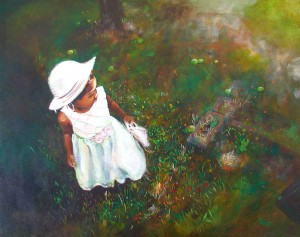
Tucky's Little Diva stopped me in my tracks.
The artwork was as high-quality as at most of the art fairs I attend in the Midwest, with a variety of media and styles on display. I didn't see anything that really riveted my attention, however, until I encountered the Little Diva, by an artist who calls himself simply "Tucky."

"Woah, can this guy ever paint!" was my first thought. There is so much to like about this painting, it's hard to find a place to start. You can't see it clearly in the reproduction, but the man's rich, painterly style bespeaks a mastery of brush and medium that is just delicious.

Not Far from the Tree again displays Tucky's originality
of composition and his luscious painting style.
His color work is a finely-tuned balance of vibrant and muted, and his handling of value and composition means that in his best work the viewer is irresistibly pulled in.

A Tucky painting could reward a buyer with years of looking. I feel certain that each viewing would yield fresh discoveries and renewed joys.

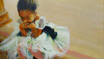
The little girl's personality shines through in Before the Show.
Tucky often paints his young son and daughter, and his deep understanding of his subjects' personalities really comes through in an appealing, satisfying way. You just know these little kids have very decided views and attitudes.

Tucky is a graduate of San Francisco State University and the Academy of Art. He also works full-time for the United States Postal Service, while fitting in painting whenever he can. According to a recent interview, he often paints in the break room at work.

Here is an artist whose work deserves gallery representation and a much wider audience than he currently enjoys. I'll do my part in that effort: you can see more of his work by viewing his website and blog.

IMAGE CREDITS: 
The two photos at the start of this post were taken by me, in Golden Gate Park. They are copyright 2011 by Jan Sherrell Gephardt, and are available for re-posting under a limited Creative Commons license that allows use with credit given. 
The images of Tucky's paintings are used here with his permission. Please do not use them without asking him first! And please look at his website and blog, to enjoy more of his work!

Thursday, July 28, 2011

Examining "Patterns in Turquoise"

Patterns in Turquoise is a May 2011 artwork.  


I first showed this piece, Patterns in Turquoise, in late May 2011 at the ConQuesT 42 Art Show.  It was completed earlier that month, and is another in my "Next Generation" series of Snowflake Dragons.

I had scanned the page of my "Original Series" Snowflake Dragon body shapes, and manipulated the file in Photoshop to change the colors, adjust shapes, etc.

The second generation, many in tertiary colors such as this blue-green, was printed on archival-quality 20-lb. Southworth business paper, using fade-resistant Hewlett-Packard inks. I then cut them out and creased, molded, folded and glued each by hand to create the tiny, stylized 3-D dragon forms.

In Patterns in Turquoise I continued to explore the textural possibilities of paper weaving in the background layers, this time adding fringed paper and using artist-quality Prismacolor pencils to add depth, texture, and richer variety to the background. The colored papers used for the background are from an acid-free Canson series.

Archival Southworth worked well for the pure-white snowflake shapes, which I stacked three-dimensionally with one in the middle that was cut from translucent (acid-free) tracing paper by Canson.

IMAGE CREDIT: The artwork shown is my own original work, photographed by me, and is copyright 2011 by Jan Sherrell Gephardt.  It is available for re-posting under a limited Creative Commons license that allows use with credit given, but no alteration.