Showing posts with label Art in the Stacks. Show all posts

Monday, April 11, 2011

Reframe II: "Through the Arch"

Here is Through the Arch in its original
shadowbox frame.  The frame is
barely larger than the tiny piece.
My small architectural piece Through the Arch started out as a study of the interplay between reality and illusion--in this case paper sculpture (actual depth) and linear perspective (the illusion of depth.)

How would it look, I asked myself, if some of the appearance of depth was an optical illusion, while the rest of it was real?  Would the combination work?

I liked the way the study was developing, so I decided it should not stay in my sketchbook to get squashed. Instead, I sized it to fit into a small shadowbox I had available.  I was scheduled to do a series of displays in 2010 for the "Art in the Stacks" program of the Johnson County (KS) Library, so I was happy to add it as a new finished piece.

Through the Arch, in its 4X8-inch frame, looked small next to the 15-inch-square earthenware piece, Four Seasons Courtyard, at the "Work: In Progress" show in September 2010 at the Central Resource Library.
As I did with Windblown, I first showed this piece in the "Work: In Progress" show, September 2010, at the Central Resource Library.  It looked just fine, tucked onto its display shelf with my earthenware "architectural" work, Four Seasons Courtyard.

But then, in December, I faced the challenge of the Great Leawood Wall--a blank expanse of display wall at the Leawood Pioneer Library.  I had to find a better way to give this small but interesting piece greater presence!

Here is Through the Arch in its current frame.
I decided to attach the backing box of the work, which was about one and a half inches deep and had slipped snugly inside the first frame, to the back of a larger mat.

I found some matboard in the studio that I thought was compatible, and matted the piece out to fit into an 11X13-inch shadowbox frame.  I placed the mat right under the glass, so the depth of the shadowbox could contain the backing box.

Through the Arch hangs on the third wire from the left, in this photo of my December 2010 "Paper View" show at the Leawood Pioneer Library.
This gave the piece enough size that it didn't pull a visual disappearing act on the Leawood wall!

However, my husband Pascal, who actually knows what he's doing with a mat cutter, looked at it after I'd prepared it, and pronounced the mat colors and frame size merely "adequate."  He thinks a coordinating green mat and a smaller, 8X10-inch frame would work better.  It's likely he's right, because he has a good eye for such things.

So who knows?  Perhaps there's yet another reframing in the future, for Through the Arch.

Friday, April 8, 2011

Reframe/Rethink: "Windblown" Case Study

Lord knows, we're all facing challenges, these days.  And one piece of advice I've heard a lot is that when facing a challenge we should reframe--that is, look at the situation from an new perspective.

Indeed, on the "sister blog" to this one, Artdog Chronicles, I've been doing a fair amount of reframing as I study the problem of how to reform schools in the U.S.  If you'd like to see some of my metaphorical reframing, I have the first and second parts of my multi-part "Thought Experiment" posted so far.

But I also have been doing quite a lot of literal reframing: of my artwork, in the last few months.  And in art, as in other things, the reframing came as the result of a challenge.  In my case, the challenge was a wall: specifically a long, empty wall at the Leawood Pioneer Library that I needed to fill with artwork.

The Challenge: a large, empty wall at the Leawood Pioneer Library.
I have been privileged to participate in the "Art in the Stacks" program of the Johnson County (KS) Library (administered by the capable Sherry Bates), and in December 2010 I was slated to display my "Paper View" show there, featuring a variety of recent paper sculptures.

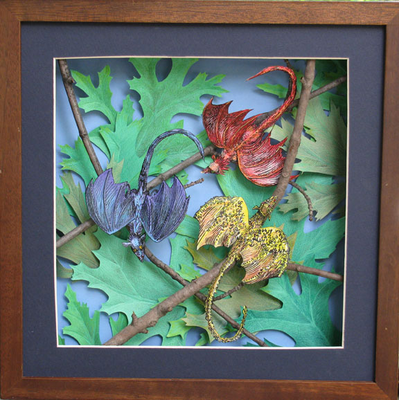
Treetop Primaries, 12X12", is my largest
paper sculpture piece to date.
The problem?  Paper sculpture of the sort I make is rather small in scale.  The largest piece I've made to date is the 12X12-inch Treetop Primaries.  Most of them are much smaller than that, usually 8X10s or 5X7s.  Some of the most recent, at the time, were even smaller.

A good example is Windblown.  I had finished the piece in August of 2010, and designed it specifically to fit into a small shadowbox I had purchased earlier that summer.  When it debuted in my "Work: In Progress" show at the Central Resource Library that September, the tiny 5X5" frame fit on a display shelf with several others.  I was fairly pleased with it artistically, but you couldn't say it had much "presence."
In its original, 5X5" frame, Windblown didn't exactly have a lot of "presence."
I knew it would visually disappear on that vast stretch of Leawood wall, yet I wanted to display it.  The situation clearly called for reframing.  I think it was my husband Pascal (formerly a professional framer) who suggested positioning it in the larger shadowbox as we ultimately did.  For an added bonus, the new frame allowed me to angle the piece as I had originally wanted.  Thus, the reframe brought it much closer to my original vision.
The reframe put the piece into the angled orientation I'd wanted all along, and the 12X12" frame showed much better on the Leawood wall than the 5X5" frame could have.  Windblown is the second piece from the right in the "Paper View" show photo at right.  Treetop Primaries is second from the left, the lower of the two pieces.
The reframe met the challenge: it made it possible for Windblown to make a positive contribution to the "Paper View" show, as well as be the centerpiece of the "3-D Art by Jan Sherrell Gephardt" show at the Antioch Library in February 2011, and stand up to the wall and the other pieces in the Westwood City Hall show in March 2011.

In both art and life, reframing can offer major advantages!


Note: All photos are by Jan Sherrell Gephardt, of her own artwork.

Thursday, February 10, 2011

Now Showing: 3-D Art by Jan Sherrell Gephardt at Antioch Library

"3-D Art by Jan Sherrell Gephardt"
The reception's over, but the show goes on.  My artwork remains on display through March 2, 2011, at the Antioch branch of the Johnson County (KS) Libraries, as part of the "Art in the Stacks" program.

The show includes ten artworks, nine paper sculpture (mostly non-fantasy subjects) and one earthenware.  It is available for viewing during regular library hours.  Librarians at the location have selected some excellent books on paper-based arts and crafts, to accompany the show.

Please come see it, if you're in the area and haven't been there yet!

The Antioch branch of the Johnson County (KS) Libraries

Wednesday, November 24, 2010

“Work: In Progress,” Varied Subjects


My artwork was on view September 2-19, 2010, at the Johnson County (Kansas) Library’s Central Resources Center.  This post shares images and commentary from that show.

The "Work: In Progress" show spans several decades, and gives kind of a past/present/future view of my work. It included some of my 2-D work from my "first art career" in the 1980s, all of the current paper sculptures, and sketchbook pages, which show some of my works in progress--a glimpse of the future.

In my last post, I showed the work from the south-side display case, which focused on my fantasy artwork, and included 2-D pieces dating back to the 1980s, when I was showing and selling my artwork exclusively in the science fiction and fantasy genre.  In this post, I focus on works from the north-side display case, which address a variety of non-genre subjects.


The northern (right-hand) display case at the library was devoted to work on a variety of topics.

 Development pages for "Midwest Flora" Series, 2009.
In September 2009 I took a series of photos near the site of the Hidden Glen Arts Festival, Olathe, KS, which formed the nucleus for a new series. This sketchbook spread shows some of the studies I did for what I intend to be an ongoing series.


"Monarch Season" 2009-2010, mixed media paper sculpture.
This was the first piece I started, in the "Midwest Flora" series. It includes four species of plants, as well as a Monarch butterfly, created to scale.

 "Wind in the Grass" 2010, mixed media paper sculpture.
I used a "design approach" to create this small piece, floating a "cropped" rectangle of grasses against a textured background. It also is part of my ongoing "Midwest Flora" series.

"Windblown" 2010, mixed media paper sculpture.
In this piece I returned to my love of rendering leaves (see "Treetop Primaries" and "The Leaf Thing" in the Fantasy Subjects album for this show). My objective was to explore the expressive possibilities in making the leaves seem not only like they were blowing in a wind gust, but also to explore ways of "floating" them above one another so they would seem airborne. This piece is the third one completed so far, of my ongoing "Midwest Flora" series.

Development pages for Yemeni Architecture Series, 2010.
Ever since I first discovered the beauty of traditional Yemeni architecture, I've wanted to make art about it. Greatly aided by Google Image Search, and later by my treasured friend Zaid, I have been attempting to do justice to these amazing structures in the medium of paper sculpture. This is just one of many spreads from recent sketchbooks.

 "Sana'a Fantasy" 2010, mixed media paper sculpture.
 This was the first piece I created, based on the wonderful traditional architecture of Yemen. Unfortunately, some of the architectural features truly are "fantasy." When I showed it to my dear friend Zaid, he gently informed me that the windows are all wrong. I now am at work on several pieces that attempt to portray the windows of Old Town Sana'a more accurately—but in the meantime, I still felt the dimensionality of the buildings and mountains created an interesting design.

"House on a Rock" 2010, mixed media paper sculpture.
This piece is based on architecture from the mountainous northeast part of Yemen, though once again my extraordinarily helpful friend Zaid has alerted me that I've mixed different villages' styles. I'll try to do better in future works!  There were multiple challenges involved in cutting these pieces in perspective, in reverse (the construction lines are on the back).  However, the hardest part of making this piece has to be the rocks. I added the Prismacolor pencil marks before folding, so I had to do a lot of imaginative visualization to get them to come out looking right.  I now list "can fold rocks" as one of my super-powers.

 "Through the Arch" 2010, mixed media paper sculpture.
This small piece also is an architectural study, but it is not based on the buildings in Yemen. It was more an exploration of the ways I could combine the optical illusion of drawn shadows and highlights to create visual texture, with the actual dimensionality achieved by layering several depths of real texture.

"Four Seasons Courtyard" 2007, earthenware and glaze.
I based this piece on traditional Islamic garden design (as a microcosm for Paradise). Each corner references a different season—perhaps it is not the most subtle expression of the idea that we live in Paradise right here on earth, but I had fun with it.

 "Fields Like Patchwork" 2007, earthenware and glaze.
Aside from the pun in its name (the fields are laid out like a 9-patch quilt block), this piece also expresses my love for the beauty of the earth as seen from an airplane window.  I deeply loved working with handbuilt ceramic sculpture, and would like to explore this medium further in the future.

 Developmental pages for "Italian Greyhounds" images.
I've always loved the sleek beauty of sight hounds, so naturally when I came to own a pair of Italian Greyhounds, I knew sooner or later they'd show up in my artwork.  The tan-and-white dog in the photos on the left side of the page is my dog Jake. The little black one on the right is my Brenna.  As you can tell from my little "first prototype," I'm still working on how to turn them into paper sculpture. I've nicknamed this little guy "Oakley," because his color reminds me of a dog owned by my friends Brad and Jessica. 

I hope you have enjoyed looking at the artwork in my "Work: In Progress" display.