Friday, September 20, 2013

Creative Changes

The Artdog is leaping into a new, combined blog.
For several years, now, I have been trying to maintain two personal blogs--this one, and also "Artdog Educator"--as well as write regular posts for a third, which I manage for the Kansas City Science Fiction and Fantasy Society (KaCSFFS).

And make artwork.

And pursue writing projects.

It's time to re-balance the load.  I will continue (for now) writing posts as needed for KaCSFFS, but because of a massive new project--a science fiction novel-in-progress--I have decided to consolidate my blogs.

For now, at least, "Artdog Observations" will cease to be a separate blog.  I plan to continue making art, looking at art, and commenting about art and art-related topics, but I'll be doing it on my "Jan S. Gephardt's Artdog Adventures" blog, as part of blogging about the creative life.

I know it's a short-term pain, and I may lose some readers.  If we are parting ways here, I wish you well.

But I hope it'll be a longer-term gain, when I'm able to post somewhat more frequently.

See you on the other side?


Thursday, July 11, 2013

At Long Last! A Rosebush!

I suppose I could write "At long last! A blog post!" too. I apologize--it's been a REALLY BUSY last-two-months.

But I'm back, and I hope to begin posting regularly again.  It seems appropriate to celebrate my return to blogging with completion of a milestone--the titular rosebush.

"Rosebush #1" is actually just one part of a larger work.

There it is, in a closeup. I am kind of boggled, myself, at how long it has taken to achieve one finished rosebush. More than a year ago in the spring, I was taking pictures of neighbors' roses, with a plan to "plant" several rosebushes in my seemingly-eternal work in progress, Paradise Garden. (How "eternal"? Well, I started on the double colonnade more than two years ago.  Thank goodness that part's done, now).

From source photos I took, I developed three ink drawings of rosebushes (did you ever stop to think how many LEAVES are on a rosebush?). I scanned the drawings into my computer, and used Adobe Illustrator (more intuitive for me to use than PS.  I know: I'm weird) to add color to each leaf and blossom.  Every leaf has at least three greens on it.  Every rose has three or four different reds, plus yellow.

Took for freakin' ever, even with my Wacom tablet and stylus.  I am not above bribing myself with British detective shows on TV to incentivize sitting that long painting tiny, tiny leaves.

This is what I mean by "tiny, tiny leaves." Here it is with my hand for scale.

At long last this week, I was able to finish color work on the last of the three.  Then it was time to cut them out, sculpt, and assemble them.

Compared to painting seemingly-endless tiny, tiny leaves and flowers, cutting them out went comparatively quickly!  One episode of "DCI Banks," and I was almost done cutting the bottom layers for one and a half of the three different rosebush designs.

There are three--in one place, four--layers to the first rosebush. The top two layers on the finished one shown above are repositioned parts of the bush, not the whole thing.

The finished one is at lower left.  More are in the works, as you see.
Here are my essential tools for the cutting-and-sculpting phase. Fingernails also are invaluable.

People always ask, "do you use an X-Acto knife?" Well, yes--but those handy-dandy little scissors on the right are my primary tool.  X-Acto cuts are very straight, the puncturing risks tears, and the blades get dull really fast. I'm all about intuitive tools, so the scissors are my weapon of choice. 

The other items in the photo above are a small corkboard for cutting and sculpting against, lab-quality tweezers (worth their weight in gold), and a clay-modeling tool with different-sized balls on each end.

I hope you've enjoyed this glimpse of working on my Most Impractical Artwork of the Decade (so far, anyway--the decade is young), and the reanimation of "Artdog Observations." 

Thursday, May 23, 2013

Great Evening With the InterUrban ArtHouse

As I described in last week's post, a good critique can be valuable and energizing thing for an artist. 
Here's my presentation at the InterUrban ArtHouse's ArtMatters Critique Night.  My audience includes, L-R: fellow artists Lori Sohl, Dora Agbas, Adam Finkelston, and Nicole Emanuel. Nicole founded the InterUrban ArtHouse.
I deeply value the insights of a weekly gathering of artist friends which we simply call Art Group.  I also had an opportunity recently to participate in the first-ever ArtMatters Critique Night, conducted May 1, 2013 by the InterUrban ArtHouse in Overland Park, KS.

Elizabeth Berkshire's paintings are inspired by metal surfaces and rust textures. Her viewers, L-R, are sculptor Deron Dixon, JCCC's Larry Thomas, Lori, Dora, me, and Adam, as above.
This Critique Night was held at a quaint, small-group gathering place called the Vintage House, and artists went through a process of submitting samples of work and applying to be invited.
 
L-R: That's me (red sweater) lurking in the background, listening to Larry Thomas discussing Deron Dixon's sculptu.
Kelly Seward comments on Linda Jurkiewicz's artistic quilts.  Also visible L-R: Deron, Jerry Stogsdill, Larry, Alex Hamil, me, the quilter herself, and (far R) Nicole.
Linda Seiner discusses her torn-paper paintings, while Larry and Lori look on at R.
Alex Hamil answers a question about his work, while (L-R) Lori, Dora, and I look on. You can see some of Dora's work in the background at left and some of Elizabeth's in the background at right.
Ten of us were included in the first Critique Night, while two designated experts, Larry Thomas, chair of the Johnson County Community College Fine Arts Department, and Kelly Seward, Director of Business Programs for ArtsKC, took the lead in each discussion.  InterUrban ArtHouse founder Nicole Emanuel was originally planning to offer comments as well, but a scheduling difficulty kept her away until the latter part of the event.

I recognized the work of Alex and Linda, as having also been displayed at the Arti Gras show, which I blogged about in February.

IMAGE CREDITS: I owe a huge debt of gratitude to the InterUrban ArtHouse and its Facebook Page, and to the multi-talented Nick Carswell, for the photos used in this post.  THANK YOU!

Thursday, May 16, 2013

The Value of a Good Critique

In your creative life, how often do you seek out an honest and knowledgeable critique? 

Most artists are vulnerable creatures.  We make up new things out of assorted sources, imbue them with our personal vision, and then place them out into the harsh glare of an uncaring and often hypercritical world. To think of seeking a critique is always somewhat fraught with pain and fear.


I present my work to the group at the InterUrban ArtHouse's ArtMatters Critique Night on May 1, 2013 at the Vintage House in Overland Park, KS.

We do the best we can, but many times we just can’t figure out (or don’t realize we haven’t figured out) the Ultimate Best Possible Solution to the creative problem we have decided to tackle.

We can’t “see the forest for the trees,” because we are too close to the subject.  In my dog-show circuit days, we called that being “kennel blind”: you can see the problems with other people’s dogs, but you are blind to the problems in your own dogs.

Recently I have participated in several, extremely helpful critique sessions, focused on either my artwork or a science fiction novel I am writing. Different fields, different media, and from different sources. The photo above is from a notable recent evening (more to come).

But in each case I not only discovered solutions to problems I’d been having with the work in question—I  also became highly energized to leap back into the work with even more focus than before.  If you noticed I hadn’t been posting here recently, that is why.

Thursday, April 18, 2013

FINISHED (Part One, anyway)!

Last week, late in the day before a trip out of town, I thought I possibly had finished a project I've been working on for quite some time.  It took some living with it, but I think--yes--this part is finished.

This is Nine-Part Herbal Fantasy--Light Cycle. Stand by (but don't hold your breath) for Dark Cycle.
The project began with a series of line drawings, first sketched in pencil, then finalized in ink.  I scanned them, assembled them in an Adobe Illustrator file, and began applying color.
Here's an ink drawing for the "Flower Arch" section.

 
An early view of the original Adobe Illustrator color build of this piece made an appearance on Artdog Observations in January.  I showed pieces of it in the works in February. At the time, I actually thought the Dark Cycle would be finished first.

I shared this image in February.
Why two cycles?  It's actually not that complicated.  

As I was doing the color builds, I realized that some of the sections were coming out considerably lower in overall key than others.  I couldn't decide which version I liked better.  Yes, I confess: indecision actually was the inspiration.

A comparison of two sections, built on the same "base drawing" and adjusted one each for the two variations, may offer a glimpse.

Here are Light Cycle and Dark Cycle variations of the "Herbal Arch" section (mirrored, you may note).
One of the developments that came up very late in the process of putting the piece together was an idea that developed at my newly-resumed Monday night Art Group.

Corners and sides are tilted inward.
Toward the center, everything lies closer to the base level.
The bases of the sections do not lie flat, except for the "rootball" center.  The others are tilted: higher toward the outside, down to base-level farther in.

IMAGES: All artwork and photos are copyright (c) 2013 by Jan S. Gephardt. You may re-post them without alterations and with attribution and a link back to this blog post; otherwise, all rights are reserved.

Saturday, April 6, 2013

Ernie Button's "Vanishing Spirits"

Visual experiences are where we find them--and they can literally be anywhere.  Part of "seeing the world through the eye of the artist," (one of my mother's favorite phrases), is to pay attention to the visuals around us everywhere.

I'll give you a case in point: Ernie Button.

When was the last time you were inspired by dirty dishes?
Ernie Button is quite a wonderful photographer, as you can see if you wander through his website (I recommend it!).  But he didn't get picked up by National Public Radio until he neglected to do his dishes.

As Audrey Carlson described it, in her piece The Wonderful World of Whiskey Art, "Ernie Button was putting a Scotch glass left out overnight into the dishwasher when he noticed something — a white, chalky film on the bottom of the glass. He held it up to the light and, upon closer inspection, could see a series of fine, lacy lines running along the inside of the glass."


Aberlour
Having spotted (sorry) this interesting visual effect, he did what artists do: he explored it. Photographers, as their name suggests, work with the medium of light.  

Button shined different colors of light through the residue, looked at it from different angles and with different backgrounds, and--being a photographer--got out his macro lens and took pictures of it.

Dalwhinnie 122
As you might imagine, a scotch enthusiast could find this project irresistible.  While he seems, from a quick overview of the images posted in his Vanishing Spirits portfolio, to favor Aberlour (at least for his photos), he has documented his willingness to try other brands, such as Balvenie, Dalwhinnie, or Glenfyddich.

This admirable broad-mindedness has yielded a growing trove of images that range from the celestial to the otherworldly to the weirdly interesting.  Since he only posts the ones he considers most aesthetically successful, it has taken him about 6 years of drinking scotch (it stretches my credulity to think he'd buy top shelf scotch and not drink it) to amass the current collection.

I wish him many more happy years of photography . . . and a stout liver.
At L: Balvenie Double.  At R: Glenfyddich.


IMAGE CREDITS: The photo of the dirty dishes is courtesy of a Real Clear Science blog post by Ross Pomeroy, "A Scientific Argument for Cleaning Dirty Dishes." The images for Aberlour, Balvenie Double, and Glenfyddich are from the "Whiskey Art" post (although they also may be seen on Button's portfolio, along with Dalwhinnie 122.  Many thanks to all these sources!

Tuesday, April 2, 2013

Fun in the Freight House Neighborhood-Part II

I had a wonderful day, between lunch with a good friend at Lidia's Kansas City, and a stroll through two of Kansas City's great small art galleries on Baltimore St. near the Freight House, in the southern part of the Kansas City Crossroads.

Julia Fernandez-Pol's Lily Pad Light is rich with texture.
The two galleries are similarly named near-neighbors, the Leedy-Voulkos Art Center, and Sherry Leedy Contemporary Art.  This entry focuses on my visit to Sherry Leedy's gallery.  In an earlier entry I talked about some fascinating artwork I found at Leedy-Voulkos.

The Texture Tour
The artwork that really spoke to me at this gallery all seemed to be playing with texture in one way or another. 

In the artwork of Julia Fernandez-Pol, it is the actual, physical texture of the oil paint, which I'd guess must have been applied with a palette knife, that is the most riveting aspect.

For me, the rich colors and textures in these images added up to a delicious visual feast that rewards the eye on many levels.

Mark Lyon's Michael Rees
The textures of Mark Lyon, on the other hand, are created as two-dimensional visual texture, and created in a most unusual way.  Lyon describes his evolution into using the "machine-assisted" "humidrawer" technique in an interesting essay on his website.

The artwork appears to be a large photograph, from a distance.  Move in closer, however, and you'll discover the amazing patterns within. 

My favorite, I think, was the portrait of Michael Rees (shown at right), because when I looked very closely, I realized the areas inside the eyeglass frames had been rendered like a spiral moving in from the frames to the center.

To give an idea of how these textures work, I pulled a couple of examples from Lyon's site.  These are two different renderings of an eye, one using only black lines, as in Michael Rees, and the other using both black and white lines on a toned surface.

Mark Lyons 2-D texture created with mechanical help: Left: black and white lines on a toned surface; Right black lines only. 
IMAGE CREDITS:  Many thanks to the Sherry Leedy Contemporary Art artist pages for the images of Julia Fernandez-Pol's Lily Pad Light and Mark Lyon's Michael Rees (click on the artist's name for images; the image pages themselves don't seem to have a URL).  The "eye detail" images are from Mark Lyon's website.  Many thanks for all!


Friday, March 29, 2013

Fun in the Freight House Neighborhood-Part I

It's been a great day, between lunch with a good friend at Lidia's Kansas City, and a stroll through two of Kansas City's great small art galleries on Baltimore St. near the Freight House, in the southern part of the Kansas City Crossroads.

Cactus Flower by Rhonda Nass, from Leedy-Voulkos.
The two galleries are similarly named near-neighbors, the Leedy-Voulkos Art Center, and Sherry Leedy Contemporary Art.  This entry focuses on my visit to Leedy-Voulkos.  In a later entry I'll talk about some fascinating artwork I found at Sherry Leedy.

Desert Fascination
The Art Center's Front Gallery is filled with wonderful images of desert wildlife (both flora and fauna) from the "Vanishing Circles" show.

The show features "portraits" of endangered or threatened species of the Sonora Desert.  It is presented in cooperation with the Arizona-Sonora Desert Museum.

Edward Aldrich's Brown Pelican
It is a departure from the Leedy-Voulkos' more usual type of contemporary art--more representational in a "realistic" manner.  But it does any organization good to "shake things up" a little bit, even if that means showing what some might consider more "traditional" art forms.

The 29 artists whose work is included in the show certainly present a visually gorgeous show.  The animals, from highly endangered pupfish to more widely-distributed ospreys and burrowing owls (whose habitat in the Sonora Desert is nonetheless disappearing), are beautiful, exotic, and presented by artists who know their craft deeply.  The desert plants, many rather bizarre-looking to midwestern eyes, become objects of awe and wonder in some of these artworks.

Otter by Sheridan Oman
Art of a Desert Recluse
Continuing the "desert theme" in an adjacent gallery is another collaboration between Leedy-Voulkos and the Arizona museum.

As a printmaking "major" back in the day, who is incorporating more and more printmaking concepts into my own art, I deeply appreciated the Sheridan Oman show. 

Oman worked at he Arizona-Sonora Desert Museum for several years before retiring to the desert to create engravings of desert animals on copper plates. 

He never had a show during his lifetime, but his monochrome prints fill the Opie Gallery at Leedy-Voulkos, and are well worth a close-up look.

The Art Center has several other shows running simultaneously with these.  Please see their website for more information.

IMAGE CREDITS: Many thanks to the Leedy-Voulkos Art Center for the images by Rhonda Nass and Edward Aldrich.  I am indebted to the Covington Gallery for the Oman "Otter."

Thursday, March 21, 2013

The Clematis Variations

My walking buddies, L-R: Jake and Brenna
It all started on a dog walk in April 2012.

A neighbor of mine planted clematis vines, and since she's a fine gardener, her vines grew and bloomed. 

I've always liked clematis flowers and I'm fascinated by vines and the way they grow, so I took pictures of my neighbor's flowers, brought my pictures home, and started sketching.

This is Purple Clematis.
Part of the process of figuring out how to develop a new piece of artwork is exploring variations.  With the clematis images, I thought the variations all turned out in interesting ways. 

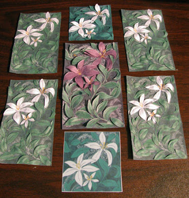
White Clematis I became an edition.
Because I print the pieces from Adobe Illustrator files, after adding a color build to my scanned line art, I can create small limited editions of multiple originals. Each piece in the edition is individually cut, sculpted, assembled, signed and numbered.

The computer images also allow size variations, and repetition of design motifs.

The White Clematis Panel series further explores the possibilities of repeating a design, combined with paper sculpture.
IMAGES: all photos and artwork in this post are the intellectual property of Jan S. Gephardt.  You may post them without alterations, and with attribution and a link back to this post.  Otherwise, all rights are reserved.

Thursday, March 14, 2013

Storyboards of the Ages

A few months ago, I wrote a post about ancient animations.  Apparently, just because they were limited to painting with mineral pigments on cave walls, that was no reason for early cave painters not to dream of ways that their pictures might move.

Howard Terpning's classic painting, The Storyteller
I've always believed that storytelling is one of the oldest art forms in the human repertoire, so it's not surprising that artists intent on telling stories should have come up with what we call a storyboard, to tell tales of linear sequences of events.

The term "storyboard" apparently originated at the Walt Disney Studios during the 1930s, but the idea of a sequence of images that tell a story is much, much older.

Some of the earliest examples I've been able to find come from Egyptian tombs.  There is a particularly well-preserved tomb in Thebes from the 18th Dynasty: that of Menna, whose title was Superintendent of the Estates of the King and of Amen.

As Superintendent of the Estates, part of his job was to oversee various projects for his master, and these were lavishly illustrated on the walls of his tomb.  Here's the one for the harvest:
The tomb mural Harvest shows ancient Egyptian harvesting methods in a storyboard-like sequence.
The Column of Marcus Aurelius in Rome, finished ca. 193
Trajan's Column, 113 CE
Some of the all-time top champion storyboarders of the ancient world were the Romans.  

The distinctly phallic triumphal columns dedicated to Emperors Trajan and Marcus Aurelius feature elaborate, realistically carved sequences depicting the highlights of their respective campaigns of conquest.

As you may be able to see from the photos of the two columns, they feature a winding spiral of images, going up like a "spiral storycase" from bottom to top.
This is a detail from the Column of Marcus Aurelius, showing the army and some of its plunder.
Not surprisingly, it's pretty hard to see the details of all the panels when you're squinting into the Roman sunlight, looking up at the original columns.  This viewing difficulty inspired several efforts in the 19th and 20th centuries to create plaster casts that could be viewed more comfortably. A beautiful set of casts from Trajan's Column is on display at the Museum of Roman Civilization, presented up-close and at eye level, so you don't have to miss a thing.
The Museum of Roman Civilization in Rome has plaster casts of each panel on Trajan's Column displayed in correct sequence at eye-level, so visitors can see them more easily and in more detail.
  
IMAGES: Many thanks to Robert Milliman's blog, "Also Out of My Mind!" for the image of Howard Terpning's The Storyteller. The photo of part of the Egyptian tomb mural Harvest is from the blog "A History of Graphic Design," by Guity Novin. Wikipedia provided the full-length images of Trajan's Column and the Column of Marcus AureliusParadoxplace provided the detail from the Column of Marcus Aurelius, and Wikipedia provided the image of the Museum of Roman Culture's plaster castings of Trajan's Column.  My deepest gratitude to all!  

Monday, March 11, 2013

Irving Harper: Iconic Designer--and Paper Sculptor!

Harper's 1956 "Marshmallow Sofa" from Herman Miller.
Irving Harper was a designer with George Nelson Associates, Inc., from 1947-1964, and has been described as "the most famous designer you have never heard of."

His best-known designs are the Herman Miller "Marshmallow Sofa" and the "Ball Clock" produced by the Howard Miller Clock Co.  I'm not sure there can be many American "Boomers" who have not encountered one or both of these designs in their lives.
The iconic 1964 "Ball Clock"

I did not know until recently that he also was/is a paper sculptor.  Still alive and feisty at 93, he actually seems more focused on the paper sculpture than other things, at this point.

I discovered the book Irving Harper: Works in Paper, which was released in February 2013, through GoodReads. The GoodReads site features not only a good write-up about Harper and the book, but also a slide show of his paper sculpture work.  I have chosen some of my favorites from the slide show to share here, but you can see them all at Goodreads.

I have not been able to find a title for this or the other Irving Harper paper sculptures in the slide show.

I love the face on this one, with its triangular, Picassoesque tongue.

I'm not sure I'd want these guys staring at me 24/7, but I thought the variations on a "face" were interesting.

PHOTOS: Many thanks to Design Within Reach, for the image of the Marshmallow Sofa,  and to the "SoHo Parenting" Blog for the Ball Clock image.  All others are from the slideshow at Goodreads. My deepest appreciation to all!

Thursday, March 7, 2013

Mixing It Up

I like to have several works in progress at the same time. 

Some of the "Art Parts" on my desk
Some of the current W-I-P ("works in progress") that you can see in the photo above are the Clematis variations, both Dark and Light Cycles of the Nine-Part Herbal Fantasy, and a leftover border rose from Rose Dance. Oh, yes, and some tall lilies from the background of Coming Through! as well.

Coming Through! is an edition of 25.
Technically, Coming Through! has been debuted to the world and is "finished," but the edition is numbered at 25.  I still have a lot of cutting, sculpting and assembling to do (not to mention matting).

The Clematis variations actually have been causing me to do a lot of thinking.  I started out with a base drawing that I really liked, pulled it up into 3-D, and tested out both a Purple Clematis and a White Clematis variation.  Then, for grins, I cropped the design to a square, and played with that, too.

I like them all, but now I'm having trouble arranging them in a way that I think will work well.  Keep watching this blog and you'll undoubtedly see more developments with these.

This mashup of all the Clematis variations just didn't work for me.
I have discovered that it's very stimulating to work on several things at once.

Solving a problem in one project can open a way to solve problems in others. 

An idea generated while working on a current piece often provides an idea for a new piece.

My problem is mostly that I have too many ideas, and not enough time to explore them all.

All things considered, though, it's a pretty good problem to have.

PHOTOS: All photos and all artwork shown in this post is the work of Jan S. Gephardt. You may re-post the photos if you include an attribution and a link back to this post, and if you don't alter to the images.


Tuesday, February 26, 2013

Dancing Flakes and Tree Lace

The Kansas City area has been hit with a LOT of snow in the last couple of weeks.  It has messed up traffic, and disrupted people's plans . . . but it's brought with it some beautiful visuals.

The most recent storm came in around midnight.  It was heavy enough to show under streetlights.

Different streetlight, heavy snow.

I zoomed in for a better view of the snowflake swirls in the erratic wind currents.

The snow was heavy and wet, so it piled up on branches, power lines, and other irregular surfaces.

This is a sycamore "under the influence" of the snow.

This is a pink honeysuckle in my front yard. At other times of the year it provides nectar, berries, and shelter for birds.

One more.  I love the arching of the branches, from the weight of the snow.  It was not so great to have the weight on power lines. 
PHOTOS: All photos were taken 2/26/2013 by Jan S. Gephardt.  Please do not use without attribution and a link back to this post.  Thanks.