Wednesday, September 22, 2010
I know--I usually post a different sort of art. But this one's for a cause that's close to the ol' Gazehound's heart! Well-run animal shelters are community treasures, and they deserve all the help they can get. Please vote for your favorite, and maybe they can get some extra money! If you don't have a favorite, please consider voting for mine: Animal Haven in Merriam, KS.
Thanks!
Wednesday, August 4, 2010
A Matter of Style
Dorothy Dent and Michael Albrechtsen are both artists with devoted followings and successful careers, though their paths to success have been different. They both favor oil paints, and frequently paint North American landscapes in a fairly traditional manner. Both are spiritual persons, and do not hesitate to use references to God or religious expression in their titles. Both travel considerable distances several times a year, to teach seminars.
You might think their work would look much the same. If so, you might be surprised.
I recently viewed exhibitions of each artist's work within a bit more than a week. Albrechtsen's work comprises the main show at the Rice Gallery in Leawood, KS this month. I encountered Dent's work on a recent trip to Republic, MO. I was immediately struck by their similarities--but also by the marked differences in their approaches to very similar subjects.
Here are some examples.
The 1958 documentary 4 Artists Paint 1 Tree shows four artists painting a tree en pleine air in a California field. Each artist has a markedly different style, so each tree painting looks distinctly different, even though the original model was the same tree.
It's really pretty cool, I think. Individuality shines through.
Monday, July 19, 2010
Should we call it the Leawood Arts District?
By "out there," I mean what many in the Kansas City Metro think of as "out there" in southern Johnson County, KS.
I'll be the first to grant that southern Johnson County doesn't exactly have a reputation for being stylish or artistic. Much of the artistic community around town tends to think of it with a What's the Matter with Kansas? frame of mind: as a wasteland of white-bread suburbanites in cookie-cutter plastic palaces.
If you think of it that way, however, you haven't been paying attention.
I recently attended the Johnson County Art Crawl, held Friday and Saturday, July 16-17, 2010. Four of the five galleries on the itinerary are located in a relatively small area between 115th and 119th Streets, bounded on the west by Nall Avenue, and on the east by Tomahawk Creek Parkway--an area that I've started calling the Leawood Arts District. I couldn't get the link to Google Maps to work right, so I've included a screen shot.
A person in good walking shoes could have walked, Kansas City Crossroads-style, between the Prairiebrooke Gallery (A on the map), Eva Reynolds Fine Art Gallery (B), Leawood Fine Art Gallery (C) and The Rice Gallery of Fine Art (D). However, unlike in the Crossroads, parking was not an issue, so it was easy to drive. The fifth location was only a few blocks away, at the Tomahawk Ridge Community Center, which now hosts Overland Park's "Art at the Center" series.
There were no colorful crowds on the streets, such as you see on First Fridays in the Crossroads, but other aspects of the event compared very well. The artwork I saw on display was easily equal to, or better than, much of what you typically see on a First Friday. These galleries also had efficient air conditioning, decent wine, fresh hors d'oeuvres, and good live music.
The art on offer was a nice mix of local and nationally-known artists. In several cases, the artists were both nationally-known and local! Examples are the first Kansas City solo show by Michael Albrechtsen at the Rice Gallery, an exhibition by sculptor Tom Corbin at the Eva Reynolds Gallery, and several new, large paintings by George Jones, featured at Prairiebrooke. "The Abstracts Exhibition," a collection of works selected by Friends of Overland Park Arts, was the attraction at Tomahawk Ridge, and a group show featuring work by many of the gallery's excellent artists was the focus at Leawood Fine Arts.
These five are by no means the only art galleries in Johnson County--nor are they the only good ones. What should command the attention of every art lover in the KC metro, however, is the relative concentration of them in this fairly small area, and the uniformly high quality of the offerings to be found in the Leawood Arts District.
Thursday, July 8, 2010
Gallery Personalities
But I never was so clearly aware of how much a gallery can have its own individual style or personality, until recently. My husband and I were rambling through the Kansas City Crossroads Arts District when we encountered two examples of how distinctive a gallery’s “personality” could be.
The first was the new 2010 Gallery at 2010 Main Street, Kansas City, MO. We walked in and immediately “recognized” the wall colorings and characteristic groupings of images on the walls. After a few moments we recognized some individual artists’ work, as well. “Wait!” We both thought, “This looks like the Park Place!”
At left is the homepage for their website. It gives a good idea of 2010 Gallery's look.
We’d been to the Park Place Gallery in Leawood, KS seven months earlier, but we knew it had closed soon after we were there. The “look” of 2010 Gallery was unmistakably similar. We later discovered that we’d been correct: this was the new “incarnation” of the same gallery. 2010, like Park Place, is the work of Tim Morrison and Rachelle Craig. We’re glad to see them back! 2010 Gallery is a strong new addition to the Crossroads.
At right is a screen shot of the Park Place homepage. See the similarities?
The second wasn’t as much of a surprise—we already knew that Red Star Studios had moved from their former 17th Street location to the Belger Arts Center at 2100 Walnut St., Kansas City, MO. Red Star not only has gone through a change of location, but it also is transitioning to new ownership. The manager, ceramic artist Tara Dawley, brings consistency to the transition, because she also was manager and deeply involved in the “old” Red Star, owned by fiber artist Susan Hill.
The wide-open space at Belger is much different from the rather tight quarters of the old gallery space on 17th Street, but the display strategies are consistent. They feature white, neutral, or rich, finished-wood surfaces and 3-dimensional groupings to show off the work of the gallery’s ceramic artists.
At left is an example of a display in Red Star's old 17th St. gallery. It shows the work of Mike Jabbur and Michael Fujita.
Red Star’s current show is “The Fundamentals of Clay,” featuring the work of Ted Adler and five Wichita State University graduate students:
Nathan Carris Carnes, Lauren Clay, Todd Hayes, David Hellman, and Joe Leonard. Work by two artists from the current show (Ted Adler at right, and David Hellman below) give an idea of this show's range.According gallery staff and a conversation I had with Susan Hill at the Prairie Village Art Fair in June, the Belger Arts Center is not Red Star’s final destination. Ultimately, they will once again occupy their own space, somewhere else in central Kansas City. But for now they are alive and well at Belger, and we are glad for the chance to see their artists’ work again. Anyone who is interested in the ceramic arts should pay close attention to their shows.
Discovering respected “old friends” in new places is a pleasant experience. I am excited to see both of these “old friend” galleries settling gracefully into the Kansas City Crossroads Arts District. I hope you will soon go see them for yourself!
Sunday, March 7, 2010
The Kids of “Este es mi México” are Awesome!


Thursday, October 22, 2009
Why I Love Art Museums
You learn the most amazing things from the artists of the world, sometimes. Let me share a couple of fun examples that I recently discovered. I was over at the Nelson-Atkins Museum of Art yesterday (our local museum in Kansas City), mapping out a route for the field trip my class is going to take there tomorrow.
The field trip is about Notan, Chiaroscuro, and still life—and I found some good resources, of course (the Nelson-Atkins is an awesome museum). But I had more fun collecting oddball bits of knowledge I never dreamed I’d encounter.
First of all, who would have thought that the Netherlands in the 17th century would be a place to look for Italian Greyhounds? People who know me are aware that I’ve been trolling the listings on Petfinder.com recently, seeking to correct my current, deplorable state of doglessness with an “IG.” But I really didn’t expect to see any in Gallery P17.
I was wrong. First of all, there was Jan Steen’s the-more-you-look-the-more-you-see-in-it painting, Fantasy Interior with Jan Steen and the Family of Gerrit Schouten (1659-60), which I can share with you because the Nelson allows non-flash photography of its own collection (thank you!!).
Do you see it? Right there, front-and-center, is a little dog that—if it isn’t an IG—certainly is a dead ringer for one.
Wow, I thought. Dutch winters are cold. I wouldn’t have expected an IG to do well in unheated buildings there, but it’s hard to argue with the historical record. I continued on, and promptly encountered this painting.
This is Hendrik van Vliet’s Interior of the New Church at Delft (ca. 1660-70), and what are those two small creatures at lower left and center? They look extremely much like Italian Greyhounds to me. What do you think?
They are too small to be greyhounds or whippets (whippets weren’t bred till the 19th century in England, anyway). No, they’re IGs. And you also might note they are strolling nonchalantly with their families . . . inside a big new church that was the pride of the community. Dogs in church? Cool!
But the fun wasn’t over yet. Did you know that, according to a Roman Catholic tradition in Boulogne, Italy, St. Luke (the Gospel-writer) was an artist? They have a revered icon there of the Madonna, and tradition has it that St. Luke painted it. I learned this in Gallery P14 when I discovered Saint Luke Displaying a Painting of the Virgin (1652-53), by Giovanni Francesco Barbieri, whom the information card said was called “Il Guercino.”
Of course, Il Guercino, in true Baroque style, didn’t try to make the icon look like an icon. But it was an interesting idea to me that one of the “biggie” saints might be thought to have been an artist. Later, I looked up more information on Il Guercino, and discovered that his nickname means “he who squints.” Was he nearsighted, I wondered. No. According to Wikipedia, that source of all kinds of wonderful knowledge, Il Guercino squinted because he was cross-eyed.
Cross-eyed? Talk about an occupational disability! Can you imagine any guidance counselor in his/her right mind saying, “Sure, Willie! Art sounds like a great career! Go for it!” to a kid who was cross-eyed? But you know, old “Squinty” turned out to be a pretty darn good painter. It just goes to show, you should follow your dreams, eh?
All in all, it was a fascinating excursion. Dogs in church, and cross-eyed Baroque masters: who knew? And that’s why I love art museums.
Sunday, June 7, 2009
A Fiber Extravaganza: the Surface Design Association's Members Show

The Surface Design Association left its mark on First Friday in Kansas City in June, and my group of friends started at the “epicenter” of the SDA’s influence, the Belger Arts Center, where the association’s Members Show, “Surface Matters,” occupied the ground floor exhibition area.
More than 200, eighteen-inch-square pieces were submitted to the show, which was judged by Alice Kettle and Jennifer Angus. Both of these judges also had solo exhibitions on the third floor.
The Belger
Center allowed me to take photographs, so I have a nice group of them for this entry. The first one shows part of the exhibition area, next to the movable glass garage-door-style entry area. The second shows a view of the same door/window, now raised some, from the outside. I think this makes the former warehouse an interesting and flexible display space.“Surface Matters” offered an interesting array of materials, colors, and approaches, despite the rather rigid size requirements. While most were fairly flat, some extended well into the third dimension. Inevitably, some appealed to me more than others.
I have chosen six to include here. I think that for me the most interesting aspects were rich colors and surface textures, a certai
n amount of 3-dimensionality, and a certain amount of layering. As you'll see from my choices, I am drawn consistently to these qualities, as well as to fairly vibrant colors and quite often, diagonals moving through the picture plane. As you also will note, however, the artists each have made a unique and personal statement with their pieces.At right is a good example of many of these qualities: Aerial Map #3, by Rebecca Cross. The rich texturing of the repeated lines of stitching give character and dimension to the background areas, and complement the 3-D parts that splash acro
ss the picture plane at a diagonal.Timeless Memory, by Gerri Calpin at left, uses many similar elements, and even some of the same palette, but evokes a more subtle mood.
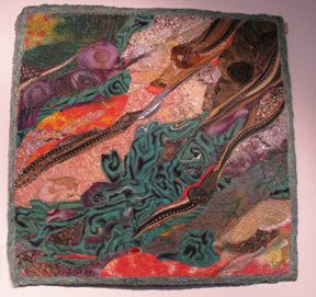
You'll note the diagonals, strong colors, and rich surface textures once again in Malachite, at right, by Marianne Williamson. Williamson, however, uses a greater variety of textures, and a broader range of colors.
We find an even brighter burst of colors in Calypso, below left, by Phillipa Lack. Here we find a greater variety, not only of colors and textures, but also of materials, including
the shiny beads that sparkle through the composition evoking the theme given by the name.Brooke Atherton also used beads to enrich the surface of her piece, M
atriarch's Child, below right. Her bold diagonals are splashed across a more stable square shape at the center, keeping a dynamic tension between the irregular lines of stitching and surface enrichment, the rough X-sh
ape at the center, and the duller, cooler, more stable and calm squares that anchor the composition.The squares are a bit more irregular in Pieces Moving Through Dimensions, by Hellenne Vermillion, at left. We still have diagonals working here, and the surface texturing is just deliciously rich, but the palette is more subdued, and the key much lower, except for the high notes in the center area.
I hope you were interested to see these images from the "Surface Matters" show. Going to see it was a valuable experience. I'm looking forward to next year's show!


