Thursday, May 5, 2011

Announcing the Spring Mail Piece!

After a number of frustrating delays, the Spring Mail Piece has finally started arriving in subscribers' mailboxes!

The "Sakura Panel" is part of the Spring Mail Piece.  It
features a quote by Rainer Maria Rilke.
The Spring Mail Piece is the second of a five-part series.  It is a multiple original--that is, a limited-edition print, in this case created digitally using archival-quality inkjet inks printed on acid-free paper.  Because the piece is assembled from three different drawings and an added piece, there is no single "original," from which the prints are reproduced.  The print itself, complete with an added piece, is the orignal.

The USPS provided the
 stamp design element.
I started the Mail Piece Project in January.  It is a conceptual artwork, resulting from a three-way collaboration between me (creating the images and assembling the pieces), the United States Postal Service (which provided the stamp--an integrated part of the design--and adds its own marks in the process of delivery), and the subscribers (who financed the project, and who complete each piece when they open, look at, and react to their unique Mail Piece original).

The address panel and back of each mail piece must be drawn foot-to-foot,
to look right on the finished piece.  The pansies among the rocks under the
forsythia on the address panel of the Spring Mail Piece were inspired by the
stamp chosen for this part of the series.
The elements in the Spring Mail Piece came from a variety of sources.  The pansies on the stamp inspired part of the design on the address panel.  The stamp, not totally coincidentally, was officially issued from right here in Kansas City, last June 22.  It is the Love: Pansies in a Basket stamp, and its design is taken from Hallmark Cards, Inc's all-time best-selling greeting card.  The card was created from a watercolor by Dorothy Maienschein; Derry Noyes designed the stamp.  The quotation and poem came from the "Quote Garden" website (if you like them, there are plenty more on the site!).
Inside of the Spring Mail Piece a pop-up section accents Persephone's flowery
Greek meadow.  This Mail Piece features the Persephone myth as part of its
spring seasonal theme.
Each of the Mail Pieces is proving to require about 5-6 weeks' time for development and production.  In just a few weeks I'll be starting research for the Summer Mail Piece.  If all goes well, it will arrive in subscribers' mailboxes in early July.

PHOTO CREDITS: The image of the Love: Pansies in a Basket stamp is courtesy of the United States Postal Service.  All other photos in this post were taken by Jan Sherrell Gephardt, of her own original artwork. 

Thursday, April 28, 2011

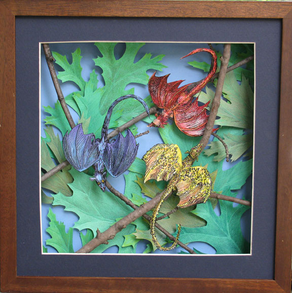
Reframe IV: "Snowflake Dragons"

   
This is my original set of boxed, unmatted "Snowflake Dragons,"
at the February 2011 sf convention, Snowflake 13.
I made the first of my series of "Snowflake Dragons" as a group of whimsical color groupings for Snowflake 13, a small science fiction convention in February 2011.  I'd been invited as the Artist Guest of Honor, and wanted to do something special for the convention.  My earlier post, "Fun at the 'Flake'" tells of that adventure.

Unframed Snowflake Dragons could not have been included
in the display in the Stiles Gallery.
I wanted to display my unsold Snowflake Dragons at the March 2011 exhibition in the Stiles Gallery at Westwood City Hall, but they had to be framed, if I planned to show them there.

I set the boxes aside, pulled out some of my unused shadowboxes, and here are the results.

I added another, larger snowflake to my little piece, Orange on Blue #1,  to complete it for framing. I hope it is a fun little piece of artwork.  It also is a study in complementary colors.

The frames definitely give these pieces more presence.  This is Three Yellow on Yellow, a mostly monochromatic piece.
Yellow, Blue and Violet on Gray uses a different trio, and echoes the dragons' colors in the background.

We are warned not to judge books by their covers, and we might extend that thought to judging art by the framing, but I think no one would argue that--in the "real world"--presentation makes a difference.

Friday, April 15, 2011

Reframe III: "The Wild Thing in the Weeds"

    
This was my 2009 display at ConQuesT 40,
a science fiction convention held over Labor
Day weekend.  Clockwise from the upper left:
The White Dragon, A Nest in the Wildwood,
and The Wild Thing in the Weeds.
My small fantasy piece, The Wild Thing in the Weeds, is one of my most recent "reframes," although it was one of the earliest pieces of artwork I did.

I finished it in the spring of 2009.  I had just completed A Nest in the Wildwood, which had been in the works for nearly two years, following my first paper sculpture, The White Dragon.  All three were made in a similar way: each has a somewhat abstract, acrylic background, with a fantasy creature made of white paper nestled into it.

Wild Thing completed the "white on acrylic" phase, for me.  After I finished it, I felt I had explored that approach enough to feel satisfied.  New ideas and variations had begun to beckon, and I moved on to the "twig dragons" with Denizen of the Winter Trees and Treetop Primaries in 2009-2010.

Here's the original 2009 frame for
The Wild Thing in the Weeds.
I made Wild Thing small, in the hope that I could price it in an affordable range for the art buyers who would see it first at the Kansas City science fiction convention, ConQuesT 40.  In the interest of thrift, I also framed it in a small plastic box I had been able to adapt.  The box kept the price down, certainly, but I never really liked how it looked.

Apparently the potential buyers didn't like how it looked, either, because I didn't sell it.  I did not include it in the collection I gathered for the "Great Leawood Wall" that provided so much inspiration for the reframing work I've recently described in earlier posts, regarding Windblown and Through the Arch.

However, when I was preparing for the Westwood (KS) City Hall show in March 2011, I decided to reframe it using a similar strategy to the one I'd used on Through the Arch.


Here is the current reframing of The Wild Thing
in the Weeds
, prepared for the 2011 Westwood
City Hall show.
I removed the plastic part, but kept the box I'd built the piece into. I cut a mat to fit the new, larger frame--as with Through the Arch, I used an 11X13-inch shadowbox--and attached the box to the underside of the mat's inner opening.  The mat is positioned next to the glass inside the frame, with the depth of the shadowbox accommodating the box in which the piece was made.

Reframed in this way, The Wild Thing in the Weeds became a strong new addition to the lineup in the Stiles Gallery at Westwood City Hall, in Westwood, KS.  But I'm afraid I did have to raise the price.
The Wild Thing in the Weeds started the north end of the lineup in the Stiles Gallery at Westwood City Hall in March 2011.
PHOTO CREDITS: All photos are by Jan S. Gephardt, of her own original artwork and displays.

Monday, April 11, 2011

Reframe II: "Through the Arch"

Here is Through the Arch in its original
shadowbox frame.  The frame is
barely larger than the tiny piece.
My small architectural piece Through the Arch started out as a study of the interplay between reality and illusion--in this case paper sculpture (actual depth) and linear perspective (the illusion of depth.)

How would it look, I asked myself, if some of the appearance of depth was an optical illusion, while the rest of it was real?  Would the combination work?

I liked the way the study was developing, so I decided it should not stay in my sketchbook to get squashed. Instead, I sized it to fit into a small shadowbox I had available.  I was scheduled to do a series of displays in 2010 for the "Art in the Stacks" program of the Johnson County (KS) Library, so I was happy to add it as a new finished piece.

Through the Arch, in its 4X8-inch frame, looked small next to the 15-inch-square earthenware piece, Four Seasons Courtyard, at the "Work: In Progress" show in September 2010 at the Central Resource Library.
As I did with Windblown, I first showed this piece in the "Work: In Progress" show, September 2010, at the Central Resource Library.  It looked just fine, tucked onto its display shelf with my earthenware "architectural" work, Four Seasons Courtyard.

But then, in December, I faced the challenge of the Great Leawood Wall--a blank expanse of display wall at the Leawood Pioneer Library.  I had to find a better way to give this small but interesting piece greater presence!

Here is Through the Arch in its current frame.
I decided to attach the backing box of the work, which was about one and a half inches deep and had slipped snugly inside the first frame, to the back of a larger mat.

I found some matboard in the studio that I thought was compatible, and matted the piece out to fit into an 11X13-inch shadowbox frame.  I placed the mat right under the glass, so the depth of the shadowbox could contain the backing box.

Through the Arch hangs on the third wire from the left, in this photo of my December 2010 "Paper View" show at the Leawood Pioneer Library.
This gave the piece enough size that it didn't pull a visual disappearing act on the Leawood wall!

However, my husband Pascal, who actually knows what he's doing with a mat cutter, looked at it after I'd prepared it, and pronounced the mat colors and frame size merely "adequate."  He thinks a coordinating green mat and a smaller, 8X10-inch frame would work better.  It's likely he's right, because he has a good eye for such things.

So who knows?  Perhaps there's yet another reframing in the future, for Through the Arch.

Friday, April 8, 2011

Reframe/Rethink: "Windblown" Case Study

Lord knows, we're all facing challenges, these days.  And one piece of advice I've heard a lot is that when facing a challenge we should reframe--that is, look at the situation from an new perspective.

Indeed, on the "sister blog" to this one, Artdog Chronicles, I've been doing a fair amount of reframing as I study the problem of how to reform schools in the U.S.  If you'd like to see some of my metaphorical reframing, I have the first and second parts of my multi-part "Thought Experiment" posted so far.

But I also have been doing quite a lot of literal reframing: of my artwork, in the last few months.  And in art, as in other things, the reframing came as the result of a challenge.  In my case, the challenge was a wall: specifically a long, empty wall at the Leawood Pioneer Library that I needed to fill with artwork.

The Challenge: a large, empty wall at the Leawood Pioneer Library.
I have been privileged to participate in the "Art in the Stacks" program of the Johnson County (KS) Library (administered by the capable Sherry Bates), and in December 2010 I was slated to display my "Paper View" show there, featuring a variety of recent paper sculptures.

Treetop Primaries, 12X12", is my largest
paper sculpture piece to date.
The problem?  Paper sculpture of the sort I make is rather small in scale.  The largest piece I've made to date is the 12X12-inch Treetop Primaries.  Most of them are much smaller than that, usually 8X10s or 5X7s.  Some of the most recent, at the time, were even smaller.

A good example is Windblown.  I had finished the piece in August of 2010, and designed it specifically to fit into a small shadowbox I had purchased earlier that summer.  When it debuted in my "Work: In Progress" show at the Central Resource Library that September, the tiny 5X5" frame fit on a display shelf with several others.  I was fairly pleased with it artistically, but you couldn't say it had much "presence."
In its original, 5X5" frame, Windblown didn't exactly have a lot of "presence."
I knew it would visually disappear on that vast stretch of Leawood wall, yet I wanted to display it.  The situation clearly called for reframing.  I think it was my husband Pascal (formerly a professional framer) who suggested positioning it in the larger shadowbox as we ultimately did.  For an added bonus, the new frame allowed me to angle the piece as I had originally wanted.  Thus, the reframe brought it much closer to my original vision.
The reframe put the piece into the angled orientation I'd wanted all along, and the 12X12" frame showed much better on the Leawood wall than the 5X5" frame could have.  Windblown is the second piece from the right in the "Paper View" show photo at right.  Treetop Primaries is second from the left, the lower of the two pieces.
The reframe met the challenge: it made it possible for Windblown to make a positive contribution to the "Paper View" show, as well as be the centerpiece of the "3-D Art by Jan Sherrell Gephardt" show at the Antioch Library in February 2011, and stand up to the wall and the other pieces in the Westwood City Hall show in March 2011.

In both art and life, reframing can offer major advantages!


Note: All photos are by Jan Sherrell Gephardt, of her own artwork.

Thursday, March 31, 2011

I Found a Commission "Where Two Paths Join"

Here is the montage I used to propose "first
thoughts" about the project to Marlene.
Earlier in my career I frequently drew illustrations, but recently my friend Marlene Sullivan offered a new challenge: basing a paper sculpture on a poem.

Her husband Doug had written a poem for their wedding, which she loved for its imagery and beauty.  Their anniversary was approaching, and she wondered if I could use paper sculpture techniques to compliment the poem.

This was part of a "progress report"
I sent while working on the piece.
We discussed it a bit.  She sent me a copy of Doug's poem, and we eventually worked out a composition idea that would "frame" the poem, incorporating the words into the artwork.

As you know if you read my post, "The Evolution of a Paper Sculpture," it can take months or even years for me to bring all the pieces together--literally.

Marlene was wise enough to know this, and ask about the idea several months in advance.  I began to work, gradually building the piece around the poem.  Doug has been gracious enough to let me share images that include the poem.

I am happy to report that I was able to finish the piece and ship it to the Sullivans in time for their anniversary.  Here's a photo of the finished artwork, which I titled "Where Two Paths Join."  I took this picture just before I boxed it up for shipping!  (That's why you can see a faint reflection of me in the glass).
Here is the finished artwork, Where Two Paths Join.

Wednesday, March 23, 2011

The Evolution of a Paper Sculpture

My current primary paper-sculpture-in-progress (working title: Koi's World) has had a long, rather strange development process.  I feel as if I'm solving a mystery as I go.
Here are major pieces of the developing artwork,
tentatively titled Koi's World.

I'm not sure if you can tell from the assemblage of paper sculpture pieces at right, but the idea is to show a view of the fish in its underwater fishpond environment.

The first part of this artwork's development, however, didn't seem to have anything to do with koi, or lily pads, or even ponds.  Back in 2009, I was just looking for a way to make a curving stem structure.

My 2009 "twisty stems"
You may not have thought about this, but making anything but an extremely straight, ramrod-like structure from a rolled piece of paper is a real challenge.  When I figured out how to make segments that could be assembled into "twisty stems," that was a breakthrough.  I spent a while grooving out on my sinuous structures, but no good idea for a finished piece of art seemed to develop from this.

Finally, in the fall of 2010 I picked up one segment of "twisty stem," looked at it from a new angle, and asked a friend in my Art Group, "Don't you think this kind of looks like the head of a koi?"  I've been a fan of koi (a kind of large, colorful Japanese carp related to goldfish) for years.

My assembled paper-sculpture koi
My friend stared at the paper segment for a few moments, clearly wanting to be supportive, but honest.  "No," she finally admitted.

"It just needs some development," I said.  I'll show you what I mean."  And I proceeded, by trial and error, to figure out how to make not just the head, but the whole fish.

Some of my koi reference photos in my sketchbook
In a couple of months I had a finished fish, and I also had assembled a large collection of resource images of koi, which I turned into montages with Adobe Illustrator.  I printed them out, and put them into my sketchbook, so I could refer to them for details wherever I was working.

May I just say right here that I dearly love the Internet, and especially Google Image Search, for this capability?  Back in early days, I had a physical reference image library that filled many file drawers.

I was always cutting up magazines or newspapers, and categorizing the images in manila file folders.  The result was a large, heavy, messy collection of images that were never quite from the right angle, never quite captured the exact right thing, and often weren't in color.  Moreover, the act of collecting and categorizing them was laborious and tedious.

Did I mention I love the Internet?  Oh, how dearly I love the Internet!

So at last I had my koi--but he needed a home.  Whenever I showed him to people, they said they liked him, but inevitably would ask, "what are you going to do with him?"

"Travis S." posted a photostream on Flickr that gave me my
final key to the Koi's World.  Here is one of several
sketchbook spreads I made from his underwater lily pads.
Good question!  I did research on fish ponds and lily pads, but mostly from the human point of view.  Nothing seemed to work just right, as I visualized it in my head.  Then early one morning before I was totally awake I had a flash of what it might look like from the koi's point of view.  It "felt right" immediately.

But I'm about accuracy, as well as fantasy (no, that is not a contradiction).  I want it to look right, even if it's utterly imaginary.

I'd never been underwater in a koi pond, nor did I have much opportunity to do so, in December in Kansas.  What would it actually look like, down there?  How do lily pads look from below?  What color(s) are they?  What do the stems and roots look like, and how do they grow?  I could guess . . . or I could go back to Google Image Search (not a hard choice!).

I can't express how excited I was to find a perfect--absolutely, utterly perfect!--resource in the wonderful photostream of "Travis S." on Flickr.  If you'd like to read about his adventures in photographing lily pads from below, read the 8/29/2005 entry "Montlake," on his Chicken Porn blog.

The quest for the completion of this opus continues, however.  Now I'm puzzling through how to make the "lily pad" structures, portray the pond's banks from underwater, and figure out not only what "up" looks like from this viewpoint, but how to show it convincingly in paper sculpture.

The mystery reveals itself at its own pace, not mine.  I'm definitely making progress, but at the rate I'm going you probably shouldn't hold your breath till you see the end result of this underwater view.