Thursday, August 30, 2012

How Artists act as Urban Pioneers

Last month I wrote about a report from Americans for the Arts, which outlined the economic impact of the arts, particularly in my own hometown of Kansas City.

I also sketched in a few notes about artists as urban pioneers in Our Fair City: responsible for the current boom in what is now called the Kansas City Crossroads Arts District, and attempting similar neighborhood reclamations along Troost Avenue and in the West Bottoms.

Jim Leedy is still at work in the Crossroads Arts District of
Kansas City. He is the subject of a new film about his life.
A few days ago the Kansas City Star published a profile on a “first” pioneer of the Crossroads, Jim Leedy, who also is the focus of a soon-to-be-released film. Leedy is a former Kansas City Art Institute professor, and co-founder of the Leedy-Voulkos Arts Center. The Star article gives a more in-depth look at the work Leedy and his cohorts did, to create a nurturing place for new artists, and eventually bring economic renewal to what had once been a seedy warehouse district.

As in Detroit and other places badly impacted by the Great Recession, arts are providing an avenue for economic revitalization. Many states have begun to catch on. Even Kansas—where the infamous Governor Sam Brownback proudly demolished our Kansas Arts Commission, despite a bipartisan rebuke from the Legislature—has quietly instituted a new Creative Arts Industries Commission that replicates some of the Arts Commission’s previous role.
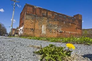
This crumbling warehouse in Utica, NY is the kind of place
where beginning artists might find cheap studio space.
The classic sequence goes like this: a low-rent district of dilapidated properties attracts artists, who go there at an early stage in their careers, in search of affordable studio space. 

Good places to look are warehouse districts that have fallen into disrepair, or down-at-the-heels business districts, where rents are low and nobody is too picky about a mess (art-making is generally not a drip-free, dust-free enterprise!).

This "Heidelberg Project" house offers an eye-popping
example of "visually interesting things in shared spaces."
Once they’ve established their studios, they collaborate, do visually interesting things with their shared spaces, and start putting on shows. People are attracted to this visually stimulating, offbeat creativity. They start coming frequently to see the art.

Other businesses notice that people are beginning to come to this area repeatedly, in ever-greater numbers. They develop a presence of their own, in this place “where it’s happening.” Business all over the area picks up.

Soon developers are offering “loft space” for urban-chic living, and the area becomes trendy. Gentrification is quick to follow, at which point the rents go too high for some of the artists, while others’ galleries are becoming more upscale, in tune with the neighborhood.

The ambiance of a successful arts district includes eateries
such as Benton Harbor, MI's Phoenix Cafe.
Now the original area is booming, still enjoying the “artsy afterglow” for several decades. Savvy businesses perpetuate the character of the neighborhood with sidewalk cafes, boutiques, and other interesting attractions, such as pocket parks, smaller, specialty museums, etc.

Meanwhile many artists have moved, looking for a low-rent district of dilapidated properties, where they can find affordable studio space . . . and the cycle begins again. 

PHOTO CREDITS: The Jim Leedy photo is by Rich Sugg of the Kansas City Star. The photo of the warehouse in Utica, NY is from the Utica Observer-Dispatch. The Ghost of Detroit Blog contributed the photo of the "Heidelberg Project" house in its blog post of the same name (couldn't find the photographer's name). The photo of the Phoenix Cafe in the Arts District of Benton Harbor, MI came from TripAdvisor.com's slideshow on the area.

Thursday, August 9, 2012

Other Paper Sculptors' Widely-Varied Art

Peter Calleson's 2006 work Holding on to Myself
Over the past few years I have encountered the artwork of several paper sculptors who have a very different approach to the medium than I do.

If you follow this blog you have seen my work and read accounts of how I make it, most recently in the just-previous post about my still-unfinished "Rose" piece and the idea of creating limited editions, and one from earlier this year, about some multi-piece animals I made.

Now I'd like to share just a few works by Peter Callesen, Allen and Patty Eckman, and The Mystery Paper Sculptor of Edinburgh.

Peter Callesen
Callesen is a Danish paper sculptor who specializes in one-sheet-of-paper pieces that can truly be amazing. His website features well over 100 of them, and I strongly urge you to go there and look at them. They are wonderful little miracles of the designer's art, and very adroitly created.

Peter Calleson, Looking Back, 2006. See his website!
I first learned about Callesen, however, in a screwy and backward way--through one of those chain emails that cycle around. A friend sent it to me, in the belief that it was a collection of entries to a contest sponsored by the Hirschhorn Museum and Sculpture Garden.

It wasn't.

Instead, it was a completely unattributed collection of Callesen works, passed off as entries in a contest that the Hirshhorn never actually held.

Why would someone create an email like this? Why totally rip off a wonderful artist, spread his work all over the Internet, and make false claims about his work? I totally do not understand the kind of mind that could do that.

I want to thank Roberta J. Morris and her investigative work for setting the record straight.

This is Allen And Patty Eckman's Eagle Hoop Dancer.
Allen and Patty Eckman

My first exposure to the work of Allen and Patty Eckman was also through an unattributed email.  A different friend sent that email, asking "Hi! Is this anything like the paper sculpture you do?"


I scrolled down to find a cascade of amazing, gorgeous, ultra-realistic, pure white pieces. I'd only been doing paper sculpture for maybe a year at that point, feeling my way along self-taught in a brand-new medium when I had time while in graduate school, and my first reaction was OMFG, if that's my competition I am SO dead.

Allen and Patty Eckman, Wife and Son of White Bull
My second thought was who is this artist, and how does s/he DO it??? As it turned out, "s/he" is a "they," and they are very generous in explaining how they do it. Since they invented the process, they rightly charge a fee, but the paper casting process they use is no secret.

I was able to track down the Eckmans when I received a second version of the email from yet a different friend--and this email had the grace to not only correctly credit the Eckmans, but also to include extensive quotes from an interview with Allen. I grumble that they didn't include a link to their website, but at least it's easy to Google "Eckman paper art."

Lucky for you, you don't even have to do that

As with Peter Callesen's work, I strongly urge you to wander through the Eckmans' online galleries. And prepare to be totally blown away.

The Mystery Paper Sculptor of Edinburgh
A pun on Ian Rankin's novel, Exit Music.
In a post about mystery-reveals regarding paper sculpture, how better to leave you than with a still-unsolved mystery?

I've been a follower of Robert Krulwich's blog, Krulwich Wonders, for some time, and last year he discovered a fascinating conundrum: an anonymous someone was leaving wonderful little paper sculptures made from books or parts of books in libraries and museums all over Edinburgh, Scotland, "in support of Libraries, Books, Words, and Ideas."

Krulwich spotlighted the seven sculptures known to have been discovered during the spring, summer, and early fall of 2011 in an October 2011 post, ending on the incredulous note that while some people in Edinburgh apparently knew the identity of the Mystery Sculptor, they had decided not to reveal it.

Sir Arthur Conan Doyle's The Lost World inspired one of the sculptures.
At the end of November, he was back with a second post, in which he focused on three more sculptures and the partial revelation that the Mystery Sculptor was in fact a woman--but that she preferred not to reveal anything else.

The mystery was quite the cause celebre in Edinburgh for a time. Readers of the Edinburgh Evening News took a poll and the result was a verdict of "We Don't Want To Know," and ultimately the Mystery Sculptor decided to honor that preference.

PHOTO CREDITS: I have to admit the Callesen and Eckman photos shown here are taken from the emails I received; by inserting a lot of links and being very up-front about my sources, I hope not to be criticized too badly. The Scottish paper sculpture images are from Robert Krulwich's blog, which got them from the Flickr feed of Chris Scott. Many thanks to all!

Saturday, August 4, 2012

"Rose Dance"--New Work-In-Progress!

I have begun a series of pieces this year that is based on a new approach to paper sculpture.

I've gotten far enough with the first one (working title: Rose Dance) to show a few samples in this space, but first I'd like to give a little history of how I got to this point.

This is the "quote panel" from the Summer Mail Piece.
My work last year on the Mail Piece Project proved to be absolutely as enlightening as I had hoped. It was a series of self-mailing multiple originals developed on the basic design of a trifold brochure, in each case incorporating some kind of paper technology.

If you would like to see some of my progress reports, take a look at New Year, Spring, and an overview of the elements that developed as consistent features. Unfortunately I got so busy I never added pages for Summer, Autumn, or Winter, though I probably should! Each edition in the series of five was a little more elaborate than the previous one.

Here is the "quote panel" for the Autumn Mail Piece.
One of the many things I gained from the Mail Piece Project was a return to my artistic "first loves" of ink drawing and limited edition printmaking (confession: I was a Printmaking "major" as an undergrad, even though I've spent a big chunk of my adult career as a graphic designer).

Here is the original ink drawing for what became
the "border panels" of Rose Dance.
Earlier, I had developed a prototype pattern for a dragon body and wings for a couple of pieces that I called "twig dragons," because they were attached to actual Silver Maple twigs from my yard.

I rendered the basic pattern as variations in ink, with both ink and color added by hand, and used them for Denizen of the Winter Trees and Treetop Primaries.

I was not satisfied with the results of the Prismacolor pencils as scanned and reproduced in the early editions of the Mail Piece Project, however--they seemed kind of muddy. So I experimented with adding color on the computer, using Photoshop and Adobe Illustrator.

The computer-based approach for adding color was used in several parts of the the last three Mail Pieces, though I also hand-colored all of those originals with Prismacolor pencils.

I also used computer color for my "Snowflake Dragons: The Next Generation" series. See Spring Swirls and Patterns in Turquoise for examples.

These color variations created separate layers.
The idea for the full Rose Dance composition originated from looking at the first panel I produced. It originally was going to be primarily an experiment: a small, limited edition of pieces that began as ink drawings that were colored on the computer, cut out, and layered.

Mirror images were designed to print 2-sided.
I developed different layers of color. Two color modulations formed the base layer (the darker one on the left, above), and a second overlay layer, with leaves and flower cut out from the background (right, above). Third and fourth layers were composed of the flower alone (see at left), printed on two sides, then cut out, sculpted, and glued at the center.

Here is the finished border panel, cut out, sculpted, and assembled.

Once I'd printed the various color layers on different weights of acid-free, archival-quality paper, I cut, sculpted, and assembled enough of the small panels to realize they could be more than simple stand-alone pieces. They could be assembled to create a border.

I experimented with several border layouts, but eventually decided I liked the square composition best. At that point I could begin the "base" ink drawing for the center.

The ink work is now done, but I'm still in the process of adding color. I'll post another article about this piece, once I have finished the whole thing.

IMAGE CREDITS: All photos and scans are of my original artwork, by me. All images are copyright 2011 and 2012 by Jan S. Gephardt, all rights reserved.

Thursday, July 19, 2012

Stimulate the Economy! Yes, the Arts DO That!

The Kauffman Center for the Performing Arts, designed for
Kansas City by Moshe Safdie, is part of our vibrant
nonprofit arts scene. 
Two hundred seventy-three million dollars.

Eight thousand, three hundred and forty-six full-time jobs.

Nine million dollars of revenue to local governments.

Even to the One Percent, that isn't exactly chump change (though the Kansas-based Koch Brothers have spent far more this year on their political agenda).

To the rest of us, those numbers look dowright impressive.

According to an article published in today's Kansas City Star, a pair of studies by Americans for the Arts has calculated that my home town benefited to the tune of those impressive numbers in 2010, thanks to the economic engine that is the nonprofit arts community in our town. 


The Arts and Economic Prosperity IV Report seeks to measure the "quantifiable economic impact of nonprofit arts and culture organizations and their audiences." The Local Arts Index is new this year, and was designed "as a tool to better understand the characteristics of the cultural life of individual communities." 


Some other towns realized even more benefit, some less. But these reports tell--yet again--a story that should be clear to anyone who's been paying attention: far from being a "frill," the arts are economically important. 

Artists are often urban pioneers, spearheading renewal in run-down neighborhoods--just as they have done in the Kansas City Crossroads, and are attempting to do in our West Bottoms and on Troost Avenue. Arts and culture are an important factor in determining a city's "livability." They foster and enhance an environment where innovation, renewal, and growth builds a more vibrant tomorrow.

Yet still it's hard to get many people to see this value. Perhaps reports like the ones reported on today will begin to open a few more eyes.

PHOTO CREDITS: The beautiful image of the Kauffman Center is from a photo gallery of images posted on the Inhabitat website (I highly recommend you go look at them, and get to know the Inhabitat site; they have many wonderful things!).  I took the Crossroads photo, myself.

Thursday, July 12, 2012

Ancient Animations

   I was fascinated to discover an article in a recent issue of Science News, titled "Stone Age Artists Produced Movies," by Bruce Bower.
   Well, not movies as we know them.  But the Stone Age artists left rudimentary animations on the walls of several European caves. Archaeologist Marc Azema (University of Toulouse-Le Mirail, France), whose work was spotlighted in the Science News article, has created a wonderful animation, showing an interesting collection of them (via YouTube):


Archaeologist Marc Azema has created several films on cave
art animations.

   Azema has been involved in a number of film and animation projects, and has been a presenter at the Annecy International Animation Film Festival as well as other places.
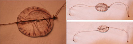
   The Science News article also included photos of a bone disk, engraved on both sides (one shows a standing deer, the other a deer with its legs drawn up under it). Stringing an animal sinew through a hole drilled in the middle and spinning it creates an optical illusion of the deer jumping or lying down (depending on your interpretation).
   This is called a thaumatrope. The idea was re-invented in the 19th century; thaumatropes were popular toys in Victorian times, but not many realized until recently that Stone Age Europeans used them too. 
   I took the images of both sides of the bone disk, using photos printed in my copy of the magazine, glued them to cardboard, and tied them with upholstery thread to simulate the sinew.  It works pretty well.
I hope you can see the images on my homemade thaumatrope, made from photos
originally published in the print version of the Science News  article. 
   A much more recent animation was discovered on a 5,200-year-old Iranian cup--until recently thought to be the world's oldest animation (though it can't compete with Chauvet Cave's 30,000-32,000-year age). I have been unable to get my Blogger interface to let me embed the "jumping wild goat" animation (Go to Major Durant's Photobucket page to see that), but here's a look at the sequence of images on the footed bowl/cup:
Here is the sequence painted along the rim of the 5,200-year-old bowl.
An archaeologist holds the ancient bowl in a CHN photo.
I had a great time looking at these, and I hope you enjoy them, too!


PHOTO CREDITS: Many thanks to Marc Azema for the YouTube video of the cave animations. The photo of M. Azema in his element is from the Annecy International Animated Film Festival's online 2012 archive. My son Ty Gephardt took the photos of my homemade thaumatrope. The images from the rim of the Iranian bowl are from the Circle of Ancient Iranian Studies website, and the image of the bowl itself is from T. Lee Harris's "Comments from the Peanut Gallery" blog. My gratitude goes to all! Please go look at their sites for more cool information.

Thursday, July 5, 2012

A Meeting of Minds . . . and Media


Karin L. Frank's chapbook, A Meeting of Minds,
is full of beautiful, intellectual poetry . . . and
also my artwork!

Last winter I had a pleasant opportunity to create a series of ink drawings to illustrate a poetry chapbook by a friend of mine, Karin L. Frank.

My first thought, when my friend approached me, was, “a poetry chapbook? Seriously?

Ah, but then I read the poems.

Several had already been published in other—as in, “mainstream”—print media, such as the Kansas City Star or Isaac Asimov's Science Fiction

I’d already known that my friend wrote interesting science fiction (prose), but the marriage of sophisticated science concepts with the poetry art form produced something rich and extraordinary indeed.

Karin titled her chapbook A Meeting of Minds: Poems from the Two Cultures, a reference to C. P. Snow’s concept of the sciences and the humanities as being two different “cultures” in “the intellectual life of the whole of Western Society.”

My holistic view of the world sees the two as integrally linked as the sides of a coin—not a strange thought to science fiction readers and writers. But the rest of Western society appears to see more of a chasm between the two.

If a chasm exists, however, these poems bridge it to elegant, often humorous satisfaction. Poetry is too seldom appreciated, these days, unless it is in the form of song lyrics. I hope some of my readers will find it worthwhile to click the Amazon link or go to Wolfweyr and open Karin’s rich vision for themselves.

Meanwhile, she’s authorized me to offer a sample:

Ecological Niche
She finds her level
on a suitable tree
where sunlight strikes,
nestles at the spot
where grubs grow plump
for baby birds,
nurtures and grooms
until wings feather out
and flocks of fledglings depart.
She remains and ripens.
Matured, plumage
reverted to scales,
she slithers down the tree,
and returns to earth.


Topological Twist
A torus and a cup
are alike to a topologist
but it’s messy
when I try to
Drink tea
from the doughnut
I’m dunking in it.


IMAGE CREDITS: Cover design is by Jan S. Gephardt, © 2012 by Honey Bee Publishing, and used with permission. Both interior illustrations are © 2012 by Jan S. Gephardt.

POETRY CREDITS: “Ecological Niche” and “Topological Twist” are © 2012 by Karin L. Frank, all rights reserved, and are reproduced here with the author’s permission. Please contact Honey Bee Publishing, P.O. Box 404, Odessa, MO 64076, for further information.

A Meeting of Minds: Poems from the Two Cultures is available from Amazon or directly from Honey Bee Publishing, via Karin's blog Wolfweyr.

Thursday, June 28, 2012

Shadow Focal Length


I don’t remember consciously noticing that shadows have what you might call a “focal length,” until a few years ago.

This 18th-century Epergne by Thomas Pitts I is in the
Folgers Collection at the Nelson-Atkins Museum of Art.
I was enjoying a long, detailed look at the intricate baskets and trays of the amazing 18th-century Thomas Pitts I Epergne at the Nelson-Atkins Museum of Art, when I became fascinated by its shadows.

Some of the shadows, cast by lower parts (closer to the surface on which it stood), were dark, sharp-edged shapes. These shadows clearly showed the multitude of intricate openings (they appear to have been blurred and softened in the official photo published online).

The taller parts, however, cast paler, fuzzier shadows. I never realized shadows had depth of field, I thought. The piece is a beautiful and amazing tour de force in its own right, but that day I was even more entranced by the shadows.

Leaves from different levels on the tree cast sharper or
blurrier shadows depending on their distance from the street.
I’ve since had an opportunity to notice this effect in other places, most notably in the shadows of trees in my neighborhood when I walk my dogs.

It’s been so hot lately that I’ve taken to walking after dark, when it’s cooler. The streetlights on the leaves create a very similar effect to the one I remember observing at the Nelson-Atkins, and I managed to get some photos.

PHOTO CREDITS: The image of the Thomas Pitts I Epergne is courtesy of the Nelson-Atkins Museum of Art in Kansas City, MO. The photo of the leaf shadows is by Jan S. Gephardt, taken in June 2012 in Westwood, KS, and may be distributed online under a Creative Commons license, providing it is not altered and credit (preferably with a link back) is given.